Addressing the importance of data and visualization skills in health and healthcare fields
According to the National Institutes of Health (NIH), “Data visualization is becoming an increasingly common method of presenting large and complex data sets, but the principles of visual communication are not widely understood or practiced.” And contrary to popular belief, visualizing data is not intuitive; it must be learned and practiced like any other skill to become proficient. To address this need, we created a Health and Healthcare Data Visualization course for our academic audience.
This Tableau Academic Programs course provides students with the skills to prepare, analyze, visualize, and communicate health and healthcare data using best practices. It is designed to cover a typical ten-week course (one quarter) at an accredited university and includes lecture slides, homework assignments, discussion board activities, Tableau demos, and test banks. Instructors can tailor the content to their class as they like. We use two newly published textbooks in the course: Tableau for Healthcare and Visualizing Health and Healthcare Data, written by the team at HealthDataViz, led by Co-founder & Principal Kathy Rowell. This course is a prerequisite for anyone working in the current and emerging data-driven health and healthcare environments and will prepare students for professional success.

I recently sat down with Kathy, a nationally recognized health, healthcare, and data visualization expert, lecturer, and author, to hear more about her experiences and opinions on the importance of data skills in the healthcare field.
Describe your experience teaching in university settings?
Kathy: What I have experienced in academia is a huge gap in awareness about the research that informs the best practices of data visualization and the process for developing great data displays. Although a few programs are beginning to offer courses, it remains a topic that doesn’t receive anywhere near the formal training it requires. Some programs include a cursory lecture about data visualization as part of another course like statistics, but it is not enough. And this does not serve the students or their future employers well.
What skills or concepts do you think are most important to cover for students using health and healthcare data?
Kathy: Students need to understand:
- The intent and purpose, the lineage of the data they are working with. Why is it being captured, how is it defined, and what can and can’t it help us understand
- Fundamental statistics and analysis
- How to conduct interviews and inquiries about the people and projects they are working on (“tell me what you want” is NOT a discovery process)
- Data visualization, design, and user interface core best practices
- The concepts of design thinking and associated methodologies such as how to create low-fidelity prototypes and conduct basic usability testing
- The concepts of design thinking and associated methodologies such as how to create low-fidelity prototypes and conduct basic usability testing

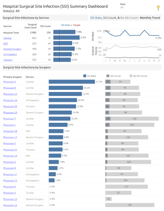
Dashboard activity example. The course utilizes activities from the textbook Tableau for Healthcare course textbook. Students will learn to create dashboards using healthcare data utilizing design thinking and visualization best practices.
Any specifics for sub-disciplines?
Kathy: Health and healthcare cover many areas, topics, and disciplines that are highly, highly complex, especially in the U.S. I am resolute in my belief that students who will be doing work in any sector of our system need a fundamental understanding of how we pay (or don’t pay) for public health and healthcare, how we fund research, and what the incentives are. And yes, this is true even for research. Clearly, we want to improve care and our health, but we also want to reduce the different financial burdens of illness and care (which will get funded first). Without this foundation, students have no conceptual frame of reference for the work they will be doing.
Words of wisdom for students (and instructors)?
Kathy: Get curious! Curiosity and critical thinking are required to be successful in this work. Research the data and be able to explain and think critically about it. Why was it created? Research your audience and explore why this data may be important to them and how it may help them. Search for ideas and techniques that follow best practices, then visualize the data.

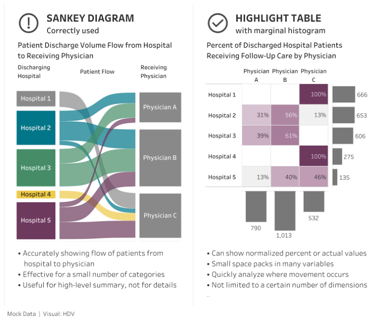
Using the textbook Visualizing Health and Healthcare Data, the course will help students understand best practices for creating charts. In this example, students learn when to appropriately use a Sankey diagram and better alternatives to use instead.
Can you speak about the future of data science and health-related fields? How do we best prepare our students for the future?
Kathy: We are still in the most nascent stages of this work, there is so much to do, and I know the future is filled with fantastic opportunities. It is no secret that we need a workforce with technical skills. But we also need students who come out of school with critical thinking and inquiry skills because they have so much more to learn and discover when their boots hit the world of work. Educating students about the systems in which they will work and challenging them with projects that reflect that world will be a great start to preparing them for the challenges at hand.
Would you share about ethics and equity in the future of working with health and healthcare data?
Kathy: As we have seen during the pandemic, we need way more complete and timely data. For example, race and ethnicity are not captured regularly or reliably, making it hard to have the complete and accurate picture needed to ensure health equity. We also need data governance and standards. As the old joke goes, if you want 12 expert opinions about a data definition, put 6 experts in the room and go around twice. That is the data world we live in—many variations in data, definitions, and governance. And finally, if I may be indulged, we need a rational way to ensure all people have access to healthcare to truly improve population health and systems. Without that, we will continue to just tinker around the edges of improvement across the board.
How to access the Health and Healthcare Visualization Course
The course materials are available as shared files and as a Canvas course export package, so instructors can quickly and easily access the course material with just a few clicks. Here’s how:
- Request an individual instructor license.
- Once approved, join our Tableau for Teaching user group to find our curriculum request form and current information on our resources. Or, fill out the form included in the email containing your license.
- You will be given access to 10 instructional modules with lectures, homework assignments, tests and quizzes, discussion boards, and a student project. We also provide a canvas course export package zip file for import directly into your university Learning Management System (Canvas, Blackboard, and others).
Tableau Academic Programs provides free Tableau licenses and learning resources for students and instructors. Instructors at accredited institutions can request a free Tableau for Teaching license for instructional use or noncommercial, academic research.
Check out Sue Kraemer and Kathy Rowell’s Lunch and Learn webinar to hear more about the importance of data skills in health and healthcare fields. Learn more.
Textbooks used in Health and Healthcare Data Visualization Course
Visualizing Health and Healthcare Data: Creating Clear and Compelling Visualizations to "See How You're Doing", 1st Edition, Lindsay Betzendahl, Cambria Brown, Katherine Rowell
Tableau for Healthcare, 4th Edition, Daniel Benevento, Katherine Rowell, Janet Steeger
Special thank you to Kathy Rowell and Janet Steeger for their support throughout the creation of this course.
Verwante verhalen
Subscribe to our blog
Ontvang de nieuwste updates van Tableau in je inbox.


