Showing posts with label table. Show all posts
April 3, 2024
March 31, 2022
#B2VB 2022/W3 - Olympic Medal Tracker
b2vb
,
basics
,
color
,
containers
,
dashboard
,
data visualization
,
filter
,
heat map
,
how to
,
medals
,
Olympics
,
parameter
,
sort
,
table
,
tableau
,
text
,
tips
,
tutorial
,
WatchMeViz
No comments

If you're not participating in the Back to Viz Basics community project yet, you should be. It's all about creating effective, simple charts, which is exactly what you need to be able to do before you build anything fancy. This will definitely help you master data visualization best practices.
For week 3, the objective was to build a text table of Olympic medal counts. Sounds simple, but unfortunately, building good looking tables isn't one of Tableau's strengths.
I also started the #WatchMeViz livestreams again. You can find all of them on this playlist. Thank you to those that attended live and asked good questions and left thoughtful comments. Below is the livestream as well as my final viz.
Until next week...
November 10, 2018
Workout Wednesday: Cross-Highlighting
Week 45 continued the post-2018.3 set actions theme. This week, Rody gave us a fairly simple, yet extremely useful challenge. We had to create a simple table that highlighting the rows and columns for the selected cell that you hover over.
The highlighter is very fickle. It seems you have to hover over a very specific spot to get it to work. I was able to make it work by using a boolean calculation, but the highlight set action was going crazy. So I went with Rody's technique of making it a continuous field so that it would actually stick.
The highlighter is very fickle. It seems you have to hover over a very specific spot to get it to work. I was able to make it work by using a boolean calculation, but the highlight set action was going crazy. So I went with Rody's technique of making it a continuous field so that it would actually stick.
October 4, 2018
Workout Wednesday: Where are Sub-Category Sales Down?
alert
,
formatting
,
indicator
,
KPI
,
modulo
,
padding
,
table
,
table calc
,
Workout Wednesday
No comments
Three weeks in a row now! Feels like I'm on a roll. This week, Luke challenged use to create an actionable table which alerts users to the problem areas very quickly. This is a neat way to get people to begin the journey from Excel tables to interactive visualizations.
Read all of the requirements here.
Some thoughts:
Read all of the requirements here.
Some thoughts:
- I had used a lot of the tricks before, so I had an idea where to start. This video should be helpful for the indicators.
- I ended up using the modulo function along with an INDEX table calc to find the odd and even numbered rows so that I could format all of the text correctly.
- Getting the year to align correctly with the numbers was the toughest part. I could tell by looking at the viz that the text was centered, yet it was made to look like it was right-aligned. Therefore, I had to come up with a solution for padding the text on the left for smaller numbers. I won't give away how I did it.
Really good challenge. I particularly enjoy the workouts that have practical use cases for every day work. Thanks Luke for the challenge!
March 6, 2017
Makeover Monday: Who are YouTube's Biggest Gaming Stars?
bar chart
,
donut chart
,
gaming
,
Makeover Monday
,
pareto
,
table
,
video games
,
youtube
No comments
This week Eva chose this simple table from SocialBlade of the top YouTube gaming channels for the Makeover Monday topic.
What works well?
- Tables are great for looking up specific values. Want to know how many views and/or subscribers the 73rd highest channel has? A table makes finding that really easy.
- Tables are precise; they provide exact values.
- The table is sorted by the rank, making it easy to process who is most popular.
What doesn't work?
- There's no real story to the data.
- Tables aren't engaging.
- Comparisons are difficult - How do the top 20% compare to the rest?
Really, there's not a whole lot more to say. I started this week with a Google search for some inspiration. I was looking for graphics that caught my eye, interesting statistics, good colors, etc. In the end, I chose to use the colors from this visualisation for my palette because I thought they fit well with YouTube's primary red.
I wanted to answer two simple questions with my visualisation:
- How do the top 20% of channels compare to the rest? Do they fit the Pareto principle?
- How many views do the top 10 channels have and how can I best compare them?
Originally I created a long dashboard, but found it too hard to see the entire story in one view, so I've switched to a wider view. Click on it for the interactive version.
February 19, 2017
Makeover Monday: Who's Winning Europe's Battle for Potato Supremacy?
bar chart
,
color
,
donut chart
,
EU
,
europe
,
highlight
,
infographic
,
line chart
,
Makeover Monday
,
potato
,
slope graph
,
storytelling
,
table
2 comments
Well, this certainly was a data set I never thought I'd see. Leave it to Eva to surprise us again. I'm really enjoying how she's mixing things up and allowing me to participate like everyone else. I also need to thank her for sending me her great color palettes again.
This week, we looked at the EU potato sector. Seriously! We're creating vizzes about potato production. The original website has things kind of all over the place. First there's this table:


Then there are a few donuts chart, most of them look more or less like this one:


They also included a few bars charts and a line chart. All in all, it's quite colorful.
What works well?
This week, we looked at the EU potato sector. Seriously! We're creating vizzes about potato production. The original website has things kind of all over the place. First there's this table:


Then there are a few donuts chart, most of them look more or less like this one:
They also included a few bars charts and a line chart. All in all, it's quite colorful.
What works well?
- Donut charts are sorted
- Tables are good for looking up specific values
- Line chart provides context by comparing to an index of 100 to make yearly change easier to understand
What doesn't work?
- Inconsistent colors
- Hard to identify the "story" in the data; The story is buried in the article.
- Pretty busy overall; too much going on
- Tables are terrible for finding insight in the data
For my version, I first read through the entire article to get a feel for their conclusions. I then focused in on the information about harvesting and decided to basically take their paragraph and turn it into a visual story. I used Eva's color palette to help highlight the important data points and I used Matt Chambers' shade slope charts blog post to create the second chart.
I wanted to create a beginning, middle and end to the story, and I feel like I did that. I used a question in the infographic title to help the reader understand what the viz is about. I used dividers to the viz into "parts" of the story and I used the chart titles as legends. Lastly, I used Roboto Condensed font to match the font used in the article.
December 14, 2015
Makeover Monday: You Don’t Know What Tony Romo’s Got Till He’s Gone
barbell
,
Dallas Cowboys
,
difference
,
DNA chart
,
Elo rating
,
fivethirtyeight
,
Makeover Monday
,
nfl
,
quarterback
,
table
,
Tony Romo
No comments
Anyone that knows me knows that I despise the Dallas Cowboys and, in particular, their golden boy Tony Romo. As a lifelong Eagles fan, I’ve been indoctrinated into the hatred for anything associated with that ugly blue star. It drives me nuts to hear how much all of the NFL pundits love Tony Romo. He’s never won anything and chokes in the playoffs every time they make them.
So when I saw this article by FiveThirtyEight, it caught my attention. Was I not giving Romo his due? Does that matter anyway? In the article, the author looks at a metric they call WOWY (or With or Without You). In its most basic sense, this metric measures the impact that a particular player has on their team by measuring the Elo rating when that players plays and when they do not. For this piece, they considered quarterbacks that were the primary QB for at least 50 games and missed at least 20 games. They then pared that down to the top 10 based on what they called the WOWY ∆ ELO.
The result is this table:
The table clearly shows Tony Romo as the 3rd most important player to their team based on this metric. Ok fine. But is there more to the story? Can this simple table be made more intuitive for the readers to understand?
I created the barbell chart below. This view makes it much easier to see the difference between the With and Without You metrics. I also added a metric to the view that calculates the difference between the two. I then created a drop down to allow you, the reader, to sort by the metric you find most interesting. In essence, I’ve turned this simple table into four stories:
- WOWY ∆ ELO - This metric shows Romo as the 3rd most missed player in NFL history when he’s out injured.
- Games With - Sorting the chart by the Games With Elo rating, suddenly Romo is only 5th on this list, yet he’s ahead of Peyton Manning. This view also shows just how amazing John Elway was when he played. Elway’s Elo rating is nearly 50% higher than the second best.
- Games Without - Interesting…the teams that Rex Grossman played for actually performed better without him in the lineup. Clearly he was quite terrible as an NFL quarterback. You can also see Romo down in 6th position; the Cowboys are definitely much worse without him.
- Difference - I added this metric to show the variation between the With and Without You values. Now Romo is back in the 3rd position, and look at that gap for John Elway…wow!
Give it a play for yourself. Do you see anything else interesting?
April 13, 2015
Makeover Monday: David Cameron's Overseas Trips
bar chart
,
bubble chart
,
David Cameron
,
detail
,
Guardian
,
Makeover Monday
,
makeovermonday
,
map
,
Prime Minister
,
table
,
UK
No comments
It's election season in the UK and The Guardian recently released some data related to Prime Minister David Cameron's travels around the World. They provided a table of all of the data at the bottom of their post, but the only viz they provided was this view aggregated by continent.
First, bubbles make comparisons harder than they need to; bar charts are much better for comparisons. This view also doesn't provide any addition insight. I can't answer a simple question like "Which countries did Cameron visit in Europe and when?"
I only had a few minutes this morning to create an alternative and here's what I came up with in about 15 minutes.
March 27, 2015
An Analysis of My Commute on Facebook's Dublin/Castro Valley Shuttle
The irony of it all.
Anyway, here is my analysis of my commute to work on the shuttle. There are filters for the time of the commute and the schedule. Use the drop down to select various displays: the default is a calendar view and the other views are various dot plots.
Click on the image for the interactive version.
- I’ve been riding the Facebook shuttle to work for almost a year.
- I’ve been tracking my commute time via Swarm check-ins.
- I decided to drive to work yesterday for my last day.
- I got my first ever speed ticket on my way to work.
Anyway, here is my analysis of my commute to work on the shuttle. There are filters for the time of the commute and the schedule. Use the drop down to select various displays: the default is a calendar view and the other views are various dot plots.
Click on the image for the interactive version.
February 16, 2015
Makeover Monday: How Does Francis Coquelin's 14/15 Season Compare to Alex Song's 11/12 Season at Arsenal?
Alex Song
,
arsenal
,
English Premier League
,
EPL
,
football
,
Francis Coquelin
,
infographic
,
keynote
,
soccer
,
table
1 comment
Ever since Alex Song left Arsenal for Barcelona in the summer following the 11/12 season, Arsenal have been in desperate need of a defensive midfielder. They've been scraping by with Arteta and Flamini, but they're both aging and not getting any better. In the 2014 summer transfer window, fans were screaming out for Arsene Wenger to sign a DM. Stubborn as he is, Wenger didn't sign one.
That decision left Arsenal very thin at the back to start the 14/15 season. Fast forward a few months and injuries, as they always do, hit Arsenal hard. They were forced to recall Francis Coquelin from a loan spell at Charlton.
As the saying goes, he's been like a new signing. In his previous spells with the first team, he failed to establish himself, but this time around, he grabbed hold of the opportunity and surely now Coquelin is the first name on the manager's team sheet.
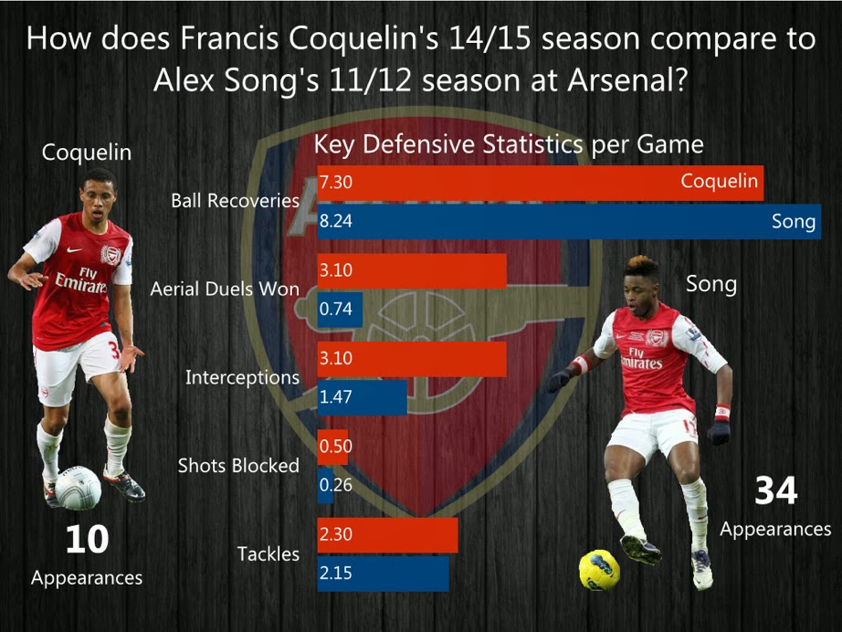
Late last week, I ran across this article from HITC Sport. In it, Dan Coombs says "Coquelin has shown already that he is playing defensively at an equal or higher level than Song's final season at the club." Dan then provided this simple table:
This table is perfectly fine. It's a table and it provides a great way to look up the data. In the end, the point of the story is to show how effectively Coquelin is playing compared to Song. I created this infographic in Keynote with the hope that it is more interesting, more engaging and makes comparisons easier.

January 12, 2015
Makeover Monday: Which SEC Schools Have Most Alums in the NFL?
bar chart
,
college
,
football
,
Makeover Monday
,
Saturday Down South
,
SDS
,
SEC
,
shapes
,
table
,
tableau
No comments
Last week, Saturday Down South posted this table, which shows the number of players over the last decade from each SEC college football team that played in the NFL. Current stars are noted.
Simple enough, yet so annoying that they aren't sorted in descending order, though it is true that an alphabetical sort is faster for finding a team. Magnitude is also more difficult than necessary to understand in a table.
With a few simple clicks, I created this interactive version in Tableau.
On my version, the bars are ranked and I included the % of total SEC players in the NFL for each team to give the numbers more context.
You can download the data here and the workbook here.
January 11, 2015
What If Premier League Standings Were Based on Points per Goal?
Aston Villa
,
English Premier League
,
football
,
goals
,
highlight
,
interactive
,
points
,
points per goal
,
Premier League
,
rank
,
scatter plot
,
slopegraph
,
soccer
,
standings
,
table
,
tableau
No comments
This week on the Football Ramble podcast (listen here), they talked about a very strange stat they have been observing this Premier League season:
From there, I wanted to understand the difference between Villa's actual place in the EPL table and their place in the fictitious points per goal table. For this view, I created a slopegraph, which I first wrote about creating in Tableau here.
If you're unfamiliar with slopegraphs, Andrew Wheeler summarizes them well in his paper "A Critique of Slopegraphs":
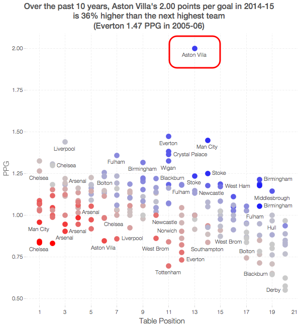
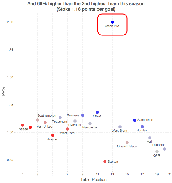
So far in the 2014-15 season, Aston Villa has the highest points per goal of any Premier League team in the last 10 seasons.This was quite intriguing to me, so this morning while I was enjoying a cup of coffee at Tully's I went to ESPNFC.com and downloaded the standings for the last 10 years. I added two columns to this dataset, which you can download here.
- Points per Goal (PPG)
- PPG Position (i.e., a rank of each team based on PPG)
I turned to Tableau to do a quick analysis. My first way of looking at the data was as a scatter plot. I wanted to see just how much of an outlier Aston Villa has been this season.


From there, I wanted to understand the difference between Villa's actual place in the EPL table and their place in the fictitious points per goal table. For this view, I created a slopegraph, which I first wrote about creating in Tableau here.
If you're unfamiliar with slopegraphs, Andrew Wheeler summarizes them well in his paper "A Critique of Slopegraphs":
Slopegraphs show values for two numeric variables by line segments for each observation by connecting points on two parallel axes. They are frequently recommended for visualizing the changes in ranked data (Bertin, 2011; Tufte, 2001).I put all of the pieces together in this simple dashboard, which you can download here. Do you notice anything else interesting or unusual?
October 29, 2014
Plot.ly - A simple interface for creating great looking charts in d3
arsenal
,
d3
,
English Premier League
,
EPL
,
matt sundquist
,
parallel coordinates
,
plotly
,
standings
,
table
No comments
Yesterday I had the pleasure of meeting Matt Sundquist, Co-Founder and COO of plot.ly. Plotly is a really interesting new data viz product that allows you to quickly build charts directly in your browser. It's built on top of d3, so it has tons of styling capabilities. If you're looking to build charts with d3, but don't want to do much, if any, coding, then you should definitely check it out. They have a free version.
What is Plotly? The folks at import.io have a great summary:
Plotly doesn't currently support things like filtering and parameters yet, but for a first pass through, I really like it and will definitely be using it more often going forward. So, here's my first plot.ly viz (be sure to hover over dots to see their awesome interactivity):
What is Plotly? The folks at import.io have a great summary:
Plotly is a young graphing and analytics startup, which makes it easy to analyze and visualize data together. Using Plot.ly, users can import data from anywhere, then make and share online graphs using Python, MATLAB, R, Excel, Julia, and their web app. Users can also share work and collaborate on projects.
The Plotly API enables users to analyze and visualize data in one place, and forms an important step in building the infrastructure for data science to be further democratized. Their goal is to be an awesome platform for collaboratively analyzing data and making graphs.From the Plotly website, in the workspace area (think of this as a worksheet in Tableau):
Easily make graphs with your data in the workspace. Import data from Google Drive or upload Excel or text files. You can apply fits, stats, and functions to your data.
Every element of a Plotly graph is customizable. Change the colors, annotate, write LaTeX, toggle graph ticks, and much more. It's up to you!The best way to get familiar with any new product is to start using it. Since I had just publish a parallel coordinates plot in Tableau yesterday, I thought I would use the same dataset and see how long it takes to build something similar in Plotly. I was pleasantly surprised by the simplicity and intuitiveness of the interface. It took me about 30 minutes to build this view, but a lot of that time was spent tweaking the settings to get them just right, which I'm perfectly ok with given the very detailed control I have over the final display.
Plotly doesn't currently support things like filtering and parameters yet, but for a first pass through, I really like it and will definitely be using it more often going forward. So, here's my first plot.ly viz (be sure to hover over dots to see their awesome interactivity):
August 25, 2014
Tableau Tip: Month over Month KPI Movers
Brian Bieber
,
calculated fields
,
change
,
KPI
,
last
,
lookup
,
monitor
,
parameters
,
table
,
tableau
,
tips
13 comments
Reader Brian Bieber (no relation to Justin), a Data Analyst at Vanguard, sent me this question:
The steps for building a KPI movers viz like this are pretty straight forward. I'm using the Superstore Sales data set that comes with Tableau in this example.
Step 1: On a PC, right-click drag Order Date to the Columns shelf. On a Mac, Option+Drag Order Date. Choose the continuous month option.
Step 2: Right-click on the Order Date pill on the Columns shelf and change it to Discrete.
Step 3: Right-click on the Order Date field on the Column shelf and choose Show Missing Values. This is important because it turns on data densification. Months where data does not exist get displayed.
Step 4: Add the dimensions you would like to slice the data by to the Rows shelf. For this example, I've used Region and Order Priority.
Step 5: Create a calculated field called Last and change the Default Table Calculation to Order Date.
Step 6: Right-click on the Last field you just create in the Measures area of the Data window and choose Convert to Discrete.
Step 7: Drag the Last field to the Filters shelf and choose 0. This will change the view to only show the latest date.
Step 8: Create a calculated field to get the value for the most recent month. Notice that I'm using the LOOKUP function. Change the Default Table Calculation to Order Date.
Step 9: Create a calculated field to get the value for the previous month. The only difference here is we need to offset the LOOKUP by 1. Change the Default Table Calculation to Order Date.
Step 10: Create two parameters: one to determine the lower limit of the top KPI (Great Performers) and one to determine the lower limit of the middle KPI (Average Performers).
Step 11: Create the KPI calculations for the most recent month and the previous month. Notice that I'm using the parameters.
Step 12: It's up to you if you want to follow this step. For this specific example, I wanted to see the KPI for this month and last month in the table, so I've added them to the Rows shelf.
Step 13: Create a calculated field that returns a boolean to compare the values for this month to determine if they are a "Mover". I'm using Brian's definition for this example.
Step 14: Drag the Movers field to the Color shelf. I chose to set the colors to a light gray when True and red when False. This way only the Movers stand out.
Step 15: Optional - Change the Marks type to Shape and drag Movers to the Shape shelf as well, then pick shapes that give the affect your looking for. I chose diamonds for the Movers and circles for everything else.
Lastly I did a few cleanup items before placing the worksheet on the dashboard you see at the top of this post:
This method could easily be changed to accommodate many different scenarios like day over day, week over week or year over year.
Download the sample workbook here.
I'm currently running some monthly data where a list of records is assigned a KPI indicator like G/Y/R. I've been asked to produce a follow-up piece that would show "movers" from the prior month's data, just in a simple text view. So I guess what I need to try and do is figure out how to do a lookback/compare from prior month data to see who went from Y/R to G on the positive change side and who went from G to Y/R on the negative side.What Brian didn't realize was that answer to his question was pretty much in the question itself; he needs to use to LOOKUP() function. I sent Brian a solution, but decided to fancy it up a bit more and add some more functionality using parameters:
Step 1: On a PC, right-click drag Order Date to the Columns shelf. On a Mac, Option+Drag Order Date. Choose the continuous month option.
Step 2: Right-click on the Order Date pill on the Columns shelf and change it to Discrete.
Step 3: Right-click on the Order Date field on the Column shelf and choose Show Missing Values. This is important because it turns on data densification. Months where data does not exist get displayed.
Step 5: Create a calculated field called Last and change the Default Table Calculation to Order Date.
Step 6: Right-click on the Last field you just create in the Measures area of the Data window and choose Convert to Discrete.
Step 7: Drag the Last field to the Filters shelf and choose 0. This will change the view to only show the latest date.
Step 8: Create a calculated field to get the value for the most recent month. Notice that I'm using the LOOKUP function. Change the Default Table Calculation to Order Date.
Step 9: Create a calculated field to get the value for the previous month. The only difference here is we need to offset the LOOKUP by 1. Change the Default Table Calculation to Order Date.
Step 10: Create two parameters: one to determine the lower limit of the top KPI (Great Performers) and one to determine the lower limit of the middle KPI (Average Performers).
Step 11: Create the KPI calculations for the most recent month and the previous month. Notice that I'm using the parameters.
Step 13: Create a calculated field that returns a boolean to compare the values for this month to determine if they are a "Mover". I'm using Brian's definition for this example.
Step 14: Drag the Movers field to the Color shelf. I chose to set the colors to a light gray when True and red when False. This way only the Movers stand out.
Step 15: Optional - Change the Marks type to Shape and drag Movers to the Shape shelf as well, then pick shapes that give the affect your looking for. I chose diamonds for the Movers and circles for everything else.
Lastly I did a few cleanup items before placing the worksheet on the dashboard you see at the top of this post:
- Moved Order Date to the Detail shelf
- Reduced the level of the row divider
- Removed the bold text from Region
- Added a calculated field to the Filters shelf that checks that the value in the Great Performers parameter is larger than the value in the Average Performers parameter.
This method could easily be changed to accommodate many different scenarios like day over day, week over week or year over year.
Download the sample workbook here.
Subscribe to:
Posts
(
Atom
)


.png)


