September 29, 2021
#MakeoverMonday 2021 Week 39 - MLB All-Time Offensive Wins Above Replacement

December 29, 2019
#MakeoverMonday: Who's More Popular? Eva or Andy?
For the last week of 2019, I thought it would be fun to look back at the download stats for Makeover Monday on data.world. They've been hosting the data for us on their platform for over two years now.
I created the original viz using Google Data Studio.
What works well?
- A clear, simple title
- Using a filter for drilling down for a specific year
- Labels on the inside end of the bars
- Tooltips are very responsive
What could be improved?
- Remove the x-axis
- Make the font bigger for the subjects
- Make it clear that this is only showing the top 10
- Include an option to increase the number of bars shown
What I did
December 16, 2019
#MakeoverMonday: How much better is the Spurs defense than the rest of the NBA?

 |
| Credit: FiveThirtyEight |
What works well?
- The title and subtitle give you an immediate sense of what the chart is about and the story it will tell.
- Coloring the bars above and below the league average different colors
- Using bars, so that you can compare the length of them instead of a line that would show trends.
- Really nice annotations
- Shading the background to draw attention to a set of seasons
- Minimal axis labels
- Clean design
What could be improved?
- Why does better go down? That's not very intuitive.
- The shading might give the impression that the coach ended where the shading ends, but Popovich is still the coach.
- It looks strange the 1980 and 2000 are offset, but 2020 isn't.
What I did
- Instead of comparing to the league average, I decided to compare the Spurs to the team of the user's choosing.
- Instead of using variance to the league average as the metric, I used defensive rating.
- I liked how the original had two colors for better or worse, so I followed that theme. My color for Spurs is always black since that's their team color.
- I included a note in the tooltip to clarify that a lower score is better.
- I wanted the Spurs going upwards if they are better, despite the axis being negative as it goes up.
July 21, 2019
#MakeoverMonday: Arsenal Player Stats 2018-19

Here's the original viz:
 |
| SOURCE: transfermarkt.co.uk |
WHAT WORKS WELL?
- A table is a simple way to display stats that serve the purpose of looking up values. That seems to be what the designer had in mind here. This viz isn't for comparing players.
- Being able to sort by the headers
- Including an image of the player; this helps those that are already familiar with them.
- Including links to the player's profile
- Other than this being used to look up information, what purpose does it server? It merely a list of facts.
- There's no context for the numbers. How does a player rank amongst the team?
- It's visually unappealing.
- I can't find definitions for some of the stats. For example, what does "In Squad" mean? No clue!
June 17, 2019
#MakeoverMonday: Finding the right Airbnb for you in Berlin


What works well?
- Since the data is about finding a place to stay, a map is super intuitive for the user.
- The map helps show concentrations of Airbnbs.
- The summary stats on the right help add context.
- There are some good filtering options.
- The red/green color palette won't work for the colorblind.
- The red/green palette makes me think of bad vs. good, but they're actually for categorical data.
- It's harder than necessary to find information about specific rentals.
August 9, 2018
The Petr Cech of Chelsea was outstanding...then he moved to Arsenal
In an Arsenalesque sense of optimism, Arsene Wenger thought bringing in a great goalkeeper would solve their defensive woes. Many fans, however, knew that the real problems were in front of the goalkeeper. Without a solid defense, a goalkeeper cannot be effective.
This led me to thinking about how Cech's first three seasons compared to his first three seasons with Chelsea, when he was widely considered one of the best goalkeepers in the World. The data shows that Arsenal more or less ruined him. Or did Chelsea's stellar defense make him better than he really is?
December 24, 2015
Premier League: Who Has the Toughest Christmas Schedule?
Using the viz below, you can see that, based on the average position of their opponents, Bournemouth has the toughest run followed by Chelsea. Leicester has the 6th toughest run, while Arsenal have the 5th easiest. This provides hope that Arsenal can finish the festive season on top of the Premier League.
I've added a parameter on the upper right to allow you to view by opposition points as well. In this view, Bournemouth and Chelsea still have the two toughest schedules, but the teams with the easiest schedules shifts a bit.
On the 2nd tab, I've added a bit of an exploratory view. Pick a metric and see the team rankings.
#COYG!
November 21, 2015
The Golden State Warriors Have the Most Efficient Payroll in the NBA
With that being said, I decided to re-work the story and elaborate on Brian’s point. In this story, I walk through an analysis of NBA payrolls versus winning percentage.
November 17, 2015
Tableau Tip Tuesday: Aligning Time - An Analysis of the Greatest 3-Point Shooters of All-Time
Click on the video tab to see how I built this.
SPOILER: At this point in his career, Curry is far and away the best 3-point shooter of all time.
October 5, 2015
Who's to Blame for Chelsea's Worst Start in 37 Years?
It’s been interesting watch it unfold from this side of the pond. Mourinho is a media darling, even getting away without punishment from the FA and the club for his treatment of team doctor Eva Carneiro. After every loss he pushes the blame on someone other than himself. It’s likely only a matter of one more loss before he gets the sack.
Given all of Mourinho’s shortcomings as a manager this year, the ultimate proof comes in the form of his players’ performances on the pitch. So far this season, those performances have been downright dreadful. Just how bad has it been? The viz below shows that things are really, really bad.
I looked at three key stats from WhoScored.com: Player Rating, Pass Completion %, and Aerial Duals Won. I took the data and filtered it down to the outfield players that made contributions both last season and this. I then created the simple analysis below.
Some notes:
- Every player has a lower rating this year than last. Particularly in poor form are Terry, Hazard, Costa and Ivanovic.
- Some of Chelsea’s most creative players are struggling to connect passes. Are the likes of Ramires, Oscar and Fabregas trying too hard under the pressure perhaps?
- Matic has been taking a lot of stick from Mourinho, but his pass completion % is 3.5% better than last year. He’s not being nearly as sloppy with the ball as his midfield counterparts, though if you read the papers you would think it was the opposite.
- John Terry is showing his age when it comes to aerial duals. He’s winning less than half as many as last year.
If things don’t turn around in the next fixture against Aston Villa, I wouldn’t be at all surprised if Jose got the sack. Why? Because you can’t fire 24 players at once and because Mourinho’s ego is too big to last more than three years at any club.
December 19, 2014
VizWiz: 1 million pageviews and counting
I started this blog as a way to document what I had been learning, starting with a simple makeover of a pie chart. 1,949 days and 402 posts later, at 8:48pm PT on December 18, 2014, my blog officially reached 1 million pageviews. I can't believe it!!
| Image From http://www.cinevox.be/ |
Thank you for your comments! Thank you for your emails! Thank you for your phone calls! Thank you for your advice! Thank you Tableau for making the most addictive piece of software I've ever used!
What better way to celebrate than with a simple viz of my basic blogger stats. Here's to another million!
All the best,
Andy
February 18, 2014
Makeover - Chart of the Day: The Seattle Seahawks are one of the NFL best defenses of all-time
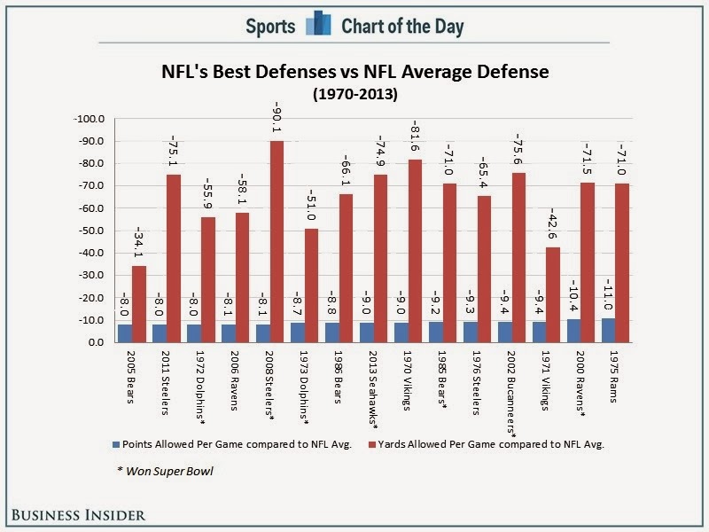
Cork Gaines of Chart of the Day has once again provided me with a terrible chart to pick apart. The idea behind this chart is simple, but the execution is nothing short of terrible. Let's start with the chart Cork produced:
I like Cork's idea: How did the Seahawks defense rank against the best defenses of all-time? His primary method of measurement is how each team compared to the NFL average. Makes sense.
However, there is way too much going on in this chart to make any sense of it.
- Cork chose to show two measures. This confused me. Do all of the teams make up the top 15 in each of these categories? I doubt it. It turns out that the measure he's ranking them on is PPG allowed vs. the NFL average. So why include YPG allowed?
- Why show 15 teams? Showing the top 10 makes it easier to find where the Seahawks rank.
- The point of the article is to highlight the Seahawks, yet he fails to highlight them. You have to do too much work to find them.
- The teams are ranked in reverse order. For some reason, nearly every chart that Chart of the Day produces is sorted backwards. I suspect they’re using Excel to create their charts. The best team should be on the left, not the right. If you don't pick up on that, you might be led to believe that the 2005 Bears had the best defense, when in fact it's the 1975 Rams (who are way over on the right).
- He's barely highlighting the teams that won the Super Bowl with a tiny asterisk.
- The chart forces you to turn your head 90 degrees to the right to read the labels.
- Is the axis needed? All of the bars are labeled, so I would say no.
I'm sure there are some other things I'm missing, but I'm too irritated with this chart to continue to make myself suffer.
Since I'm in the process of testing Tableau for Mac, I decided to build my version of the chart there.
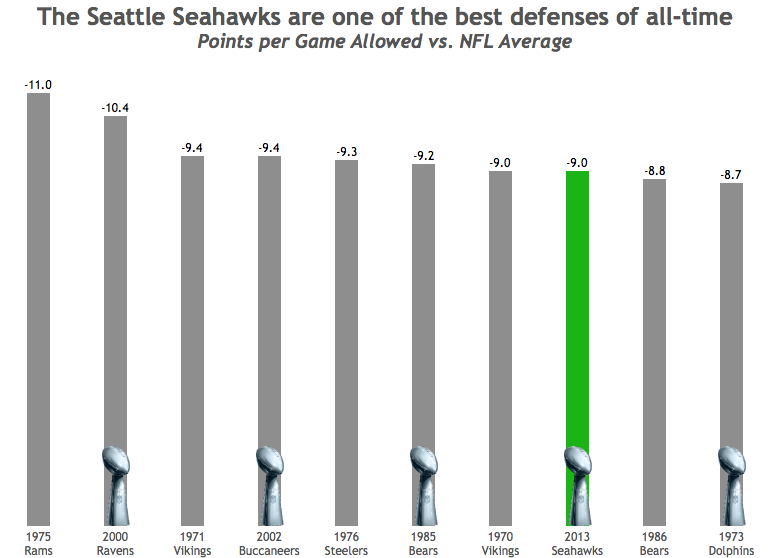
How did I address my concerns with Cork's chart?
- I decided to only show PPG allowed vs. the NFL average. I wanted to keep it simple.
- I’m only showing the top 10 teams.
- The point of the article is to highlight the Seahawks, which I've clearly done.
- The teams are ranked in the correct order, starting with the best defense on the left.
- I decided to highlight the Super Bowl winning teams by showing the Lombardi Trophy. This makes it easier to see that having a great defense does not guarantee the title.
- I've made the team names much easier to read by displaying the text horizontally.
- The bars are labeled and they all start at zero, so I've eliminated the axis.
It saddens me to see the consistently poor output from Chart of the Day. They have so much interesting sports data to work with, yet they continue to communicate their stories so, so poorly. Maybe I should send Cork a copy of Data Visualization: A Successful Design Process by Andy Kirk and/or Show Me the Numbers by Stephen Few.
September 12, 2013
Visualizing statistical significance in survey results
- Move fast
- Be open
- Be bold
- Focus on impact
I need to pause for a moment and thank two Tableau Zen Masters for their help and inspiration.
First, thank you to Jonathan Drummey for his help in getting both the manager and company results into the same view. Jonathan taught me about Data Source Filters, which I had never used before. We ended up aggregating the data so that we didn't have to have multiple data sources, but without his help early on, we wouldn't have gotten there.
Second, we need to thank Steve Wexler for his awesome work in visualizing survey results. We based many of our other reports off of work that he's done.
And now back to our regularly scheduled program...
In order to help aid with understanding, here are some tips for how to read and interpret the results:
- The dark bar represents the company in total.
- The colored bar represent the chosen manager's results.
- The width of the bars represents the statistical variation. The manager bar will always be wider than the company bar because there are less results for a manager, thus more less statistical significance.
- The color of the manager bars represents how statistically significantly different they are vs. the overall company results.
- If you see a gap between the company and manager bars, then the difference is statistically significant.
- You can filter by Manager.
- You have three chart types to choose from (more below about them).
- You have three sorting options, which allow you to answer different questions depending on what you want to compare.
The view that Heather showed in our session was the Double Gantt (TM) option. I've provided two other alternatives as well: Candle Gantt (TM) and Dots Gantt (TM).
The Candle Gannt is more or less the same as the Double Gantt, but the company bar is thinner and there are reference lines for the ends. The idea here was to make it look somewhat like a candlestick chart.
The Dots Gantt is nice because it clearly shows the outer ends of the statistical range without concern for the range itself.
I had no idea what to call these types of charts, so the names are simply a combination of the chart types (And they aren't really trademarked. Maybe I should TM them). These are all dual axis charts. Download the workbook and pull the charts apart if you're interested in seeing how they're built.
For those of you that came to our session, we owe you a heartfelt thank you. We appreciated all of the questions, comments and great interaction.
September 8, 2013
Visualizing 500,000 VizWiz pageviews
I didn't start tracking stats with Google Analytics until much later than I started the blog, so here is a snapshot of the stats via blogger.
Being a viz nerd though, I had to use the new Google Analytics connector that Tableau 8 includes to get into more detail. If this viz looks familiar, it's probably because you follow DataRemixed. I figured, why rebuild something from scratch when Ben did such a great job. So I downloaded his workbook, change the data source to my blog and that was it.
I added two features from Ben's version:
- I added an option to view by different time dimensions.
- The destinations, sources and social charts filter to the top 10.
May 8, 2013
Was Theo Walcott’s performance for Arsenal driven by motivation for a new contract?
With two matches to go in the EPL season, Arsenal is in a battle for a Champions League spot with Chelsea and Tottenham and Theo Walcott is leading scorer. He started out the season in great form, then suddenly tapered off immediately after he signed a new deal with the club.
In Arsenal’s last two matches, Theo has scored two great goals very early on in the game, at the 2’ mark against the champions Manchester United and 20 seconds into the most recent game against relegated QPR. Theo is back in form.
I was interested to see how Theo has impacted Arsenal’s overall performance. Use the viz below to see how Arsenal performs when Theo does or does not play (Arsenal have a higher winning % when he doesn’t play, though in a small sample size) and when he does or does not score (their winning % increases by 20% when he plays and scores vs. when he plays and doesn’t score).
In other words, Arsenal need Theo to play and score.
December 25, 2012
Is Mark Sanchez as bad as Sports Chart of the Day says he is? Here’s some context.
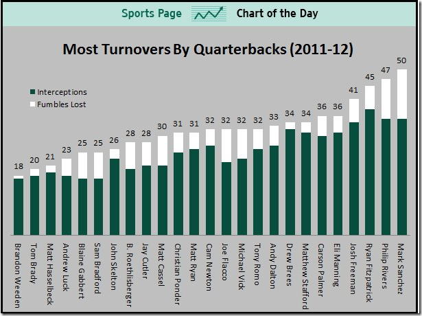
After week 14 of the NFL season, Cork Gaines more or less blamed the poor performance of the NY Jets on Mark Sanchez, saying:
Last night, Mark Sanchez turned the ball over five times, continuing a disturbing trend over the past two seasons. He now has a league-leading 24 turnovers this season (17 int, 7 fumbles lost) and 50 over the last two seasons combined. In his first two seasons, Sanchez turned the ball over just 37 times.
Corked followed this up by publishing this chart on Business Insider’s Sports Chart of the Day.
I thought “Wow, Sanchez really is terrible!” But I’m an Eagles fan, and we know terrible football. This got me thinking about Michael Vick. He was absolutely HORRIBLE turning the ball over the first few weeks of the season before he got a concussion and hasn’t played since.
In Cork’s chart, Vick is at #11, but he’s only played a full season in the NFL once. So far in 2012, Vick has 19 turnovers in 9 games, for a turnover rate of 2.1 per game. This puts Vick at #2 on the turnover rate ranking ahead of, you guessed it, Mark Sanchez.
What this should tell you, as it did to me, is that Cork’s chart isn’t normalized. Sanchez has played more games that Vick at a slightly lower turnover rate, so of course he’s going to have more turnovers.
I decided to look into this farther and gathered data through week 15 from Pro-Football-Reference.com and built this viz. (Download the data here.) BTW, if you ever need pro football data, this is by far the easiest place on the internet to find what you’re looking for.
I started with turnovers, as Cork did, and if you sort by Turnovers on the right, you see that Sanchez is now third on the list, granted he was benched for week 15.
Change the sort to Turnovers per Game and Sanchez is now sixth. Rex Grossman is first in turnover rate. No wonder he hasn’t played this year.
It was important to me to also look at win percentage to see how turnovers might correlate to winning. Change the sort to Win % and you can clearly see that those QBs at the top (the best winning percentages) have very low turnover rates, Andrew Luck being the exception, but he has seven game winning drives this year, which is a crazy number.
You can explore the relationship between turnovers and win % a bit deeper on the 2nd tab (Win % vs. Turnovers).
I chose to use a lollipop chart for these first three views. I could have chosen a dot plot, but I wanted to emphasize both the end point and the length of the bar, but I didn’t want to clutter the chart too much with a bar chart.
I then wanted to see how who has improved or regressed from last year. We do have one game less, so take that into consideration. This view confirms that Sanchez is worse this year from a turnovers perspective: 28 in 2011 in 16 games and 29 in 2012 in 14 games. Not good Mark!
For this view, I chose to use a bar chart for 2012 with 2011 as reference line. But it’s not really a reference line. It’s a dual axis chart with 2011 as a Gantt bar. For me, this view works because it gives me a quick comparison between the last two seasons.
I finish the viz off with a dot plot comparing fumbles and interceptions, each of which you can sort by on the right. Ryan Fitzpatrick threw 39 interceptions last year…39! That’s really hard to do.
I chose a dot plot for this view because I wanted an uncluttered view of two measures on the same chart, and I was only concerned about their relationship to each other, not their length.
There’s an immensely larger number of analyses you can perform on this data set. I’d be curious to see if anyone can find any hidden relationships. Give it a shot and post a comment if you find something useful.
August 10, 2012
Displaying time-series data: Stacked bars, area charts or lines…you decide!
First, let me say that this is a tremendous improvement over those produced by the U.S. Bureau of Alcohol, Tobacco, Firearms and Explosives (a.k.a. the ATF). Don’t bother reading the ATF report, unless you love 3D bar charts and 3D pie charts created in Excel.
A stacked bar chart is basically a pie chart unrolled to make a stick. And more often than not, when plotted as a time series, they do a poor job at showing the overall trends. Stacked bars are good up to three bars, no more. Why? Because it’s difficult to compare the heights of any of the bars except for the bottom bar, rifles in this case.
Let’s go through several alternative displays. If you’re interested in playing with the data, Matt published it here for me. Thank you Matt!
All of the charts below were built with Tableau. You can view an interactive version of all of these charts here and download the workbook here.
Let’s start with a redesigned stacked bar chart that uses Tableau’s built-in color blind palette.

Can you see the trends for each of the weapons? Maybe an area chart would be better.

Well, ok. Now the trends are easier to see, right? Area charts certainly improve the ability to see trends over time, but there are only two trends that give an accurate reading:
- The line at the top of the bottom area, i.e., rifles.
- The top of the top chart, which represents the total.
We still don’t have the ability to see the trends for any weapon except for rifles.
Before you read on, take out a piece of paper and sketch what you think the trend is for shotguns (light blue) based on the area chart above.
Ok. Now let’s compare the area chart above with the area chart for shotguns.
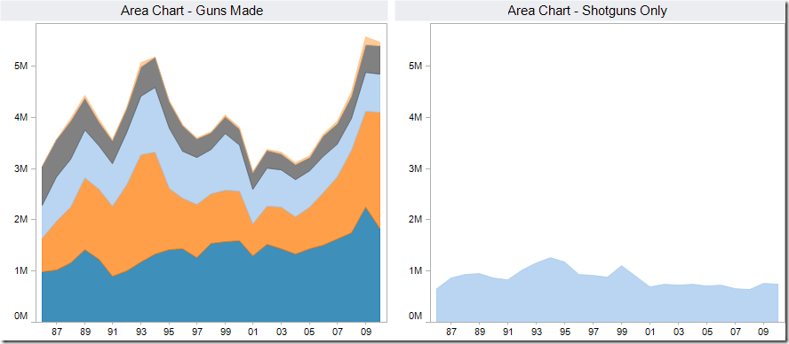
Did you come close? I doubt you did. Why? Because the tops of each color are influenced by the size of the colors below it, therefore making gauging the true size of each individual color extremely difficult.
Here’s another way to prove it. I know this isn’t a good way to represent the data, but bear with me, I’m trying to prove a point. If I overlay lines for each weapon over the area chart, look how different the shapes of the lines become.
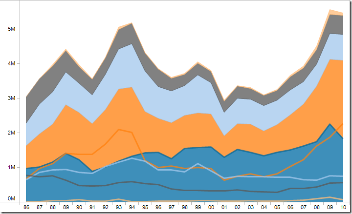
Like most time-series data, your best way to represent the data is nearly always going to be a line chart.
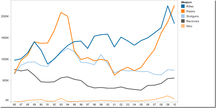
Using a line chart we can quickly make some observations:
- There was a three-year spike in the early 90s for pistols made and there’s been a similar, but longer, surge since 2006. What was the cause of the big decline in 1995? Was there a change in handgun laws in 2005 or 2006?
- Revolvers were on a steady 20-year decline until 2005-2006. Is this merely coincidental with the pistols? Possibly so, possibly not.
- Rifles have increased recently, but shotguns have decreased. Are people buying rifles instead of shotguns? Their rate of variance since 1994 has grown consistently and the gap continues to get wider.
Using a line chart, you’re immediately asking questions of your data. Rapid-fire analysis!
When analyzing time-series data across several categories, consider not only looking at the raw numbers like above, but also review how each category contributes to the total. Let’s go through the same series of charts.

We’re off to a good start with the stacked bar chart. It looks like measuring the contribution of each weapon to the total may tell us something. Let’s try it as an area chart.

Not much better, other than it looks smoother. How about a line chart?

Ok, now we’re onto something. You might think that this is the same as the line chart for the raw numbers, and I can see how you might make that conclusion at a quick glance. But let’s look at them side-by-side.
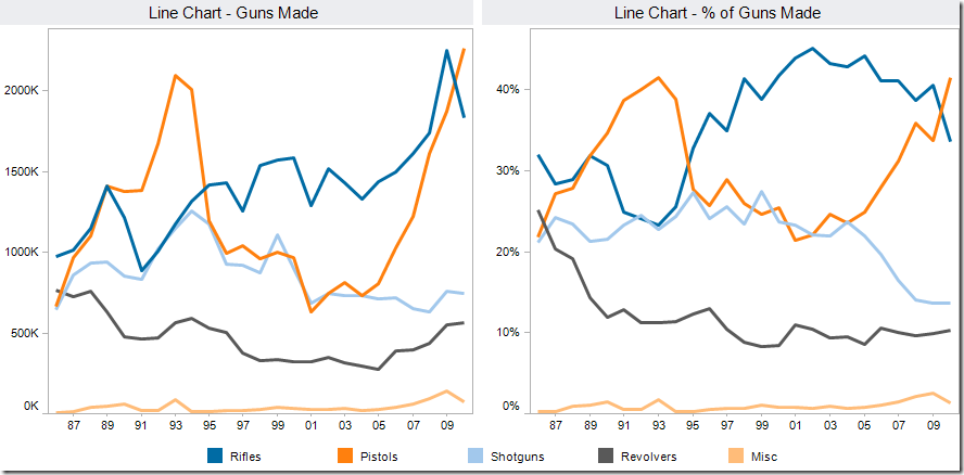
The charts look very similar up until 1997, but then look at how many more rifles started to be made compared to the rest. And look at the drop off in percentage of shotguns produced since 2004.
Hopefully you’ve learned two main lessons:
- Don’t display time-series data as stacked bars (or pies unrolled onto on a stick if you prefer). The best medium for time-series data is a line chart.
- Consider looking at both the raw numbers and their contribution to the total. It’s always a good idea to look at your data in more than one way. You may get some additional and/or different insights.
Let me wrap with two charts that disturbed me a bit as I was playing with the data for this blog post. I’m not disturbed by their visual display, but by what they reveal.
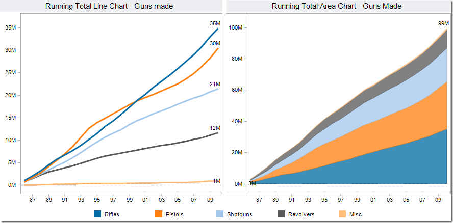
The chart on the left is the running total of guns made by gun type since 1986. The chart on the right summarizes the chart on the left.
These charts tell us that the US has manufactured over 99 million guns since 1986. Seriously! 99 million! According to the US Census Bureau, there were ~238M Americans over 18. That means that approximately one of every five Americans 18 or older owns a gun.
That terrifies me!
Perhaps political interests (and lobbyists) have played a part?? For more information on how to use the US Census Bureau data, check out this guide.
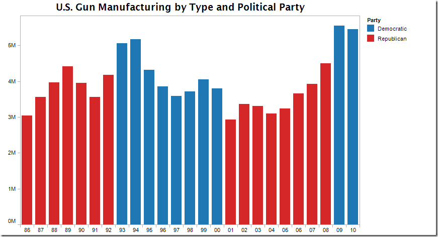
UPDATE – Source CNN: This certainly explains the drop that started in 1994 and the subsequent increase in 2005.
The Clinton administration imposed a ban on several types of military-style semi-automatic rifles and high-capacity magazines in 1994, but that ban was allowed to lapse in 2004. Obama has proposed restoring the ban, requiring background checks for buyers at gun shows, and other "common-sense measures."
May 16, 2012
Is drug testing working in baseball? An interactive analysis.
Cork Gaines wrote about the HR trend in baseball since testing started for performance enhancing drugs. He presented a chart of the trend (surprising effective given his past charts), but he never answered his own question….is testing working?
One way to determine the answer is through comparisons to other statistics.
I downloaded the season averages across both leagues and MLB in total from baseball-reference and built this interactive analysis. The stats are order by batting stats then pitching stats.
This viz allows you to compare home runs to many other statistics through the selectors at the top right. In addition you can:
- View any two statistics to look for trends by choosing a primary measure and a comparison
- Filter the time frame to all years, the pre-testing era, and the testing era (1993+)
- Filter the leagues to focus your analysis
- Click on a league at the bottom to highlight that league
In this initial view of HR vs. ERA, I see a couple of things:
- HR are on a slow descent in the testing era, especially since 2000
- ERA is in a similar decline, possibly indicating that improved pitches has had as much of an impact as testing
- Batting Average has remained flat. This means that the reduction in HR has not impacted BA.
- Teams are simply scoring fewer runs, likely due to the reduction in long balls
- The trend in complete games is despicable
What do you see? Play around with the different stats and see if you can draw any conclusions.
April 24, 2012
Do PK decisions in the EPL even out? Fergie thinks so, but the data disagrees.
What makes it even tougher is when the players dive all over the place with no intent other than to con the referee. Is anyone with me on starting a campaign for retroactive suspensions for diving? That would stop all of the diving immediately! Guaranteed!
Ashley Young has been near criminal in two recent matches. He’s even been mentioned for a position on Great Britain's Olympic diving team. Refer to the video of Man U vs. Villa and Man U vs. QPR for some of the finest acting in years. He really ought to be ashamed of himself.
But it’s not only the PKs that are called; it’s those that are not called as well. Refer to the highlights, if you can find them, of the Man U vs. Fulham game on 26 March 2012. The game was at Old Trafford, it was late in the game, there was a CLEAR penalty against Man U and, of course, it wasn’t called.
I’m not saying there’s a bias towards the “bigger clubs”, but looking at penalty kick data sure leans me in that direction. All you need to do is filter the viz below to only include teams that finished 1-4 and you’ll see what I mean.
The top four teams get way more PKs called in their favor than the rest of the clubs AND they significantly more PKs called at home. I simply can’t believe that referees are NOT intimidated by Fergie and Old Trafford?
Click on the Manchester United logo to focus on them. Look at those startling trends that appear at the bottom. Intimidation at its finest!
If you want to see the details behind the charts, go to the Team PK Stats tab.
- Look at how many PKs the top four teams have gotten over the year, both overall and at home
- Now compare that to the relegated teams (18-20)
March 10, 2012
Baseball Predictions: How good is the Marcel the Monkey Forecasting System?
If you haven’t heard of the Marcels, then you need to read up on it here. I can’t possibly summarize what the Marcels are better than their website:
The Marcel the Monkey Forecasting System (or the Marcels for short) is the most advanced forecasting system ever conceived.
Not.
Actually, it is the most basic forecasting system you can have, that uses as little intelligence as possible. So, that's the allusion to the monkey. It uses 3 years of MLB data, with the most recent data weighted heavier. It regresses towards the mean. And it has an age factor.
Yes, that’s it. Don’t read too much into it. The whole point of the system is its simplicity. But you know what? It does a decent job.
I took the Marcels forecast data (both batting and pitching) from 2001-2012 and matched it up with the “actual” data from Lahman for the same time period. I was only interested to see how the Marcels performed, so I only looked at data where the year and player existed in both systems. Get the complete set here.
I Tableaud the data to built this interactive viz (download the workbook here). There are two tabs, one for batting and one for pitching. You use them exactly the same way.
- Start by picking the stat you would like to view
- The viz at the top compares the Marcels prediction and the actual stat for all year/player records.
- Hover over a point to see the details (i.e., player, year, data, etc.)
- Click on a point and the chart at the bottom will update with records for only that player
- The points are color-coded by the prediction error (i.e., (Actual-Marcels)/Marcels)
- The charts at the bottom summarize all of the data for the stat chosen
- The lines show the Actual and Marcels data across the years
- The bars show the % error for the total year (red = under forecast, black = over forecast)
- If you want to analyze a specific player without having to hunt and peck in the scatter plot, simply pick him from the list
- Rinse and repeat with the pitching data
One of the features that I like best is that you can enter a stat minimum. For example, you first pick HR for the stat, but you are only interested in seeing players that hit 30+ HRs in a season. Enter 30 in the box and hit enter. Voila! The charts update.
Two overall themes stuck out to me:
- The Marcel over forecast nearly all of the “raw” batting and pitching stats…things like PA, R, H, HR, RBI, SB, W, ER, etc.
- The Marcels tend to forecast “calculated stats” very well, e.g., BA, HR %, OBP, SLG, OPS, ISO, ERA, WHIP
Finally, before you complain about the axes not being to the correct decimals for things like BA, OBP, etc. know that I’m using a parameter in Tableau from which I’ve built a calculation. The best you can do, that I know of, to get close to the correct number formatting is to leave it set to automatic. I don’t know of a way to force the format of the field to update based on the parameter selection.


