September 21, 2021
#MakeoverMonday 2021 Week 38 - What is your personal information worth?

Short and sweet this week. The data set is about the price of personal information on the dark web. There are three fields: Category, Product, and Price. To me, this looks like Superstore, so that's how I approached it. How can I visualize two fields that have a hierarchy?
In the video, I show you how to create a drill down with both a set action and a parameter action. Here's the video and below is the visualization.
November 12, 2019
#MakeoverMonday: Literacy Rates Around the World

Here's the original viz:
What works well?
- The data by region is ordered alphabetically, making it easy to find each region.
- The bar chart is sorted by largest to smallest.
- Nice filtering options
What could be improved?
- A diverging color palette should only be used when there is a logical midpoint or goal. I don't see those in this viz.
- The squares are hard to understand.
- I don't find the map very useful. It would be more useful if it zoomed in when a region is selected.
- There's no title.
- There's too much text.
- The bar chart seems to go out past the edge, or at least visually it appears that way.
What I did
- I created a KPI scorecard so that I could understand the patterns for the overall or an individual country. Are literacy rates improving or regressing?
- Show the distribution of the rates of the countries within each region
- Within each region, which countries are above or below the median for that region?
- How has the literacy rate changed over time?
- Allow simple filtering options.
January 26, 2017
Makeover Monday: Regional Tourism Spending in New Zealand (Take 3)
Inspired by the visualisation by Harry Enten that I highlighted today on my sister site DataVizDoneRight, I decide to look at the New Zealand tourism data again and see if I could build a similar view. After all, no data visualisation is ever “complete”. I really like how this turned out (and thank you to Eva Murray for feedback).
I incorporated a legend on the upper right to make the bars easier to interpret. Basically the grey bar shows the 25th to 75th percentile of all of the regions and the red dot indicates the median of all regions. I’ve removed the total region from the view.
September 19, 2016
Makeover Monday: Data breaches are getting bigger and more frequent
Several people have recommended Makeover Monday for the Project of the Year in the Kantar Information is Beautiful Awards, which I must admit is quite stunning and flattering at the same time. The suggestion for this week’s makeover came from Andy Cotgreave. We intentionally picked something from Information is Beautiful with the hope that it gets a bit more exposure. Shameless perhaps, but what can it hurt? This viz from David McCandless certainly deserves a makeover.
- The viz is eye-catching and definitely draws you in. There’s something to say for that.
- The interactivity is fantastic.
- Good filtering, colouring and sizing options
- The bubbles move all around for no apparent reason.
- There’s way too much overlapping, making it hard to identify any insights.
- Whether something is interesting is extremely subjective. I wouldn’t make these same choices.
- The viz doesn’t fit in a single view, requiring too much scrolling.
- Not all records are included. I guess this was done for artistic purposes as David is known to do, but it distorts the message.
 |
| Click to view interactive version |
December 10, 2014
Using data blending to compare a superset of the same data source
There is a list of products that the user can filter. The monthly sales for each product needs to be compared to median of all products across all of the months, but the median should recalculate if the user filters the region and/or priority. The end result should be a "Relative Sales" calc that is the sales for each subcategory divided by the median of all sales.The trick here is that the Subcategory filter cannot impact the median calculation. The steps below could also easily be applied to a sum, min or max. I demonstrating a median because that was the question at hand.
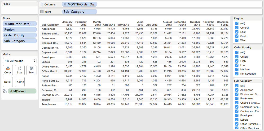
First, consider that you have a view like this, which is sales by monthly by subcategory, with quick filters for region, order priority and subcategory.
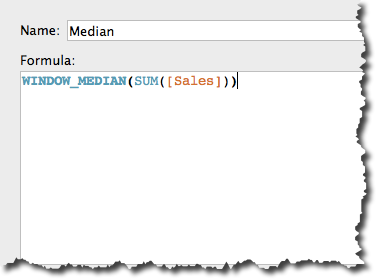
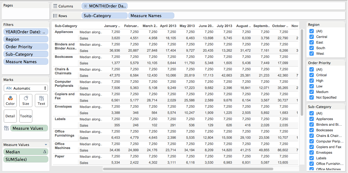
Next, create the median calculation and add it to the view. Remember, the median should account for the entire view.
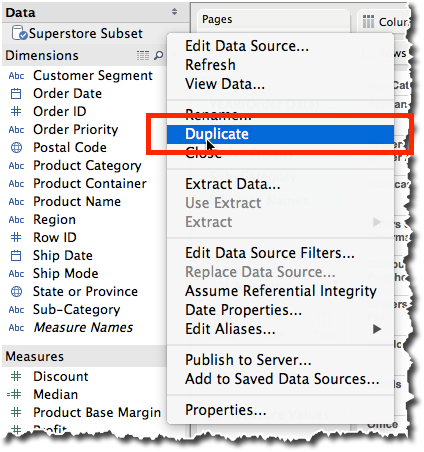
Duplicate the data source by right-clicking on it and choosing Duplicate.

Sweet! We're almost done!
Create a calculated field in your primary data source for the Relative Sales. This is going to use Sales from the primary data source and divide it by the Median Sales from the secondary data source.
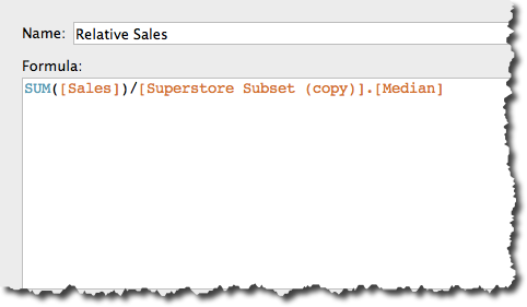
Change the default format of this new field to percentage. Choose the right level of precision for your data. Add Relative Sales to the view and again change the Compute using to Table (Across then down).

It might look like we're done now, but we're not. If I filter by Subcategory at this point, my median changes, which I don't want. To make this work, we have to tell Tableau which fields to use in the blend.
In the Dimensions list, we want Tableau to blend on Order Date, Region and Order Priority, but not Subcategory, so click/un-click the link icons as appropriate.
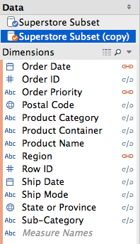
Wait! What just happened? Our median has changed! Why? Is that right? Yes, that is correct, because we removed Subcategory from the blend, therefore when Tableau calculates the median, it's no longer considering Subcategory in the calculation, which is what we want.
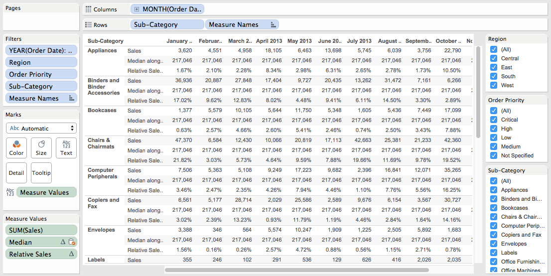
Now I need to make this look a little prettier. I'm going to change it to a line chart and allow the user to pick the Subcategory they want to highlight.


