April 10, 2024
11 Ways to Compare Two Measures
I don't believe in complexity in data visualization. I stick with simple charts when you needs to compare measures to add context.
Tableau workbook here.
April 9, 2024
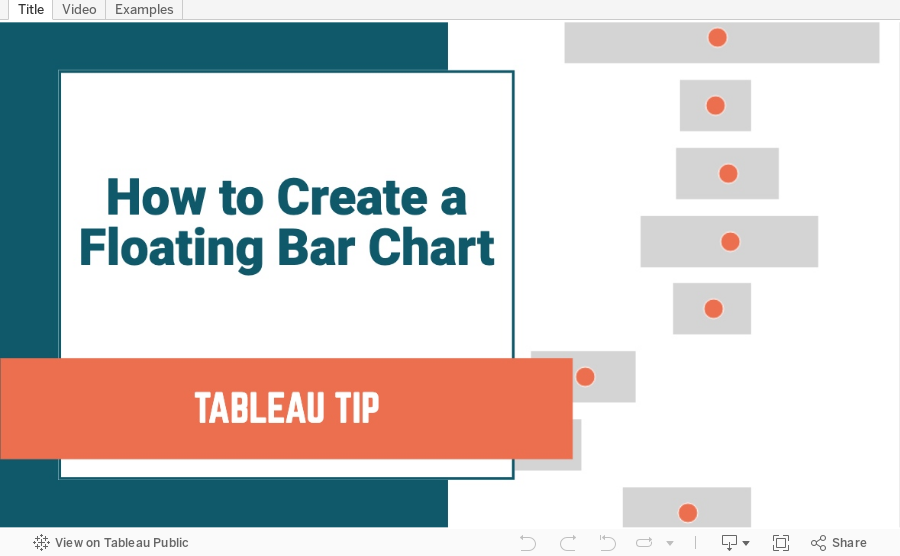
How to Create a Floating Bar Chart in Tableau
A floating bar chart is similar to a Gantt chart, except it shows the range of two data points instead of two dates.
September 4, 2023
28 Charts in 60 Minutes - Forbes Cloud 100: Companies Scaling Up and Scaling Down

How many people power the Forbes Cloud 100? Is there a correlation between company rank and employee size? Have they expanded or contracted.
Learn how to build 28 charts in 60 minutes that compare two years.

November 1, 2022
#MakeoverMonday Week 44 - Fundraising vs. Spending by Members of the 117th Congress

The midterm elections in the US are next week. If you're able to vote, please do. Democracy is at stake.
This week's data was about fundraising, spending and debt by people currently in Congress. If you missed #WatchMeViz, I showed 16 different ways to visualize this data set. Hopefully they give you a bit of inspiration for creating your own.
Catch up with the show below. In the end, I went with a bar chart that compares funds raised vs. spent by State. I also have a gantt bar to show the difference between the two. I have a tutorial of that chart here.
Below this video is an image of the dashboard I created. Click on it to see the interactive version on Tableau Public.
August 11, 2022
10 Methods for Displaying Variance with Bar Charts
Using variance as a measure in bar charts helps you:
- Add context - You can answer the question “compared to what?”
- Make decisions - You can answer the question "what should we do next?"
- Alert you to areas that need focus
In this video, I show you 10 ways to add variance to bar charts. Get the workbook here.
November 16, 2020
#MakeoverMonday Week 46: The Growth of Internet Ad Spend - 2020 vs 2012
Thanks for attending #WatchMeViz (link) for #MakeoverMonday Week 46. I enjoy the commentary and ideas you provide along the way. I hope you're learning something as well.
The topic this week was the switch in advertising revenue to the internet.
In the video, I first reviewed the initial visualization and talked about what works and what does. I then iterated through 17 different methods for visualizing the data, before settling on the one below which was inspired by Ellen Blackburn's viz about eligible free school meals and educational attainment (link)
RESOURCES
- Data Set - https://data.world/makeovermonday/2020w46
- Chart Guide - https://chart.guide/

November 3, 2020
How to Create a Floating Bar Chart

Floating bar charts are similar to Gantt bar charts, except they don't use dates or duration for the length of the bar. In this video, I show you how to use floating bar charts for comparing metrics.
Example 1 - Comparing mental health syndromes between women and men
Example 2 - Comparing year over year sales
Data Sources:
- Mental Health Symptoms - https://data.world/makeovermonday/2020w27-comparing-common-mental-disorder-by-sex
- Superstore 2020.3 - https://data.world/vizwiz/superstore-20203