April 21, 2024
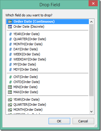
How to Create Custom Date Hierarchies in Tableau
January 31, 2023
How to Calculate Day over Day Change Excluding Weekends

In a previous tip, I showed you how to calculate day over day change and build 3 KPI cards.
However, this does not cover the case when you need to ignore weekends. In this #Tableau tip, I show you how to calculate daily change excluding the weekends.
You can copy/paste the calculations from below the video. Enjoy and good luck!
Calculations
- Latest Day
{MAX([Order Date])} - Weekday for Latest Day
DATEPART('weekday',[1. Latest Day]) - Sales for Latest Day
INT([Order Date]=[1. Latest Day])*[Sales] - Previous Day
IF [2. Weekday for Latest Day]=2
THEN [1. Latest Day]-3
ELSE [1. Latest Day]-1
END - Sales for Previous Day
INT([Order Date]=[4. Previous Day])*[Sales] - DoD Change
SUM([3. Sales for Latest Day])-SUM([5. Sales for Previous Day]) - DoD Change %
[6. DoD Change]/SUM([5. Sales for Previous Day]) - Positive Change
[7. DoD Change %]>0
January 24, 2023
How to Select a Date Range with a Set Action

September 2, 2022
5 Most Common Date Functions in Tableau
In this tip, I take you through the 5 most common date functions in Tableau:
- DATEPART
- DATENAME
- DATETRUNC
- DATEADD
- DATEDIFF
By the end of this video you will understand when to use them to meet your use case. Click here for the cheat sheet I created for these date calculations.
May 19, 2021
#WOW2021 Week 20: Can you compare Same Day to a Selected Date?

Wow! This workout will really test your knowledge of table calcs. The challenge comes from Lorna; view the requirements here.
The main purpose of this challenge is to get familiar with dates and parameters. Fortunately, every Wednesday I host what we call "Wise Up Wednesday" during lunch for my colleagues at The Information Lab and The Data School. We needed all of our brain power for this one. For us, the toughest part wasn't writing the calculations themselves. Rather, it was the logic required for the calculations.
From Lorna:
What if you want to compare a date you choose to the same DAY. For example, Tuesday 18th May 2021, would compare to Tuesday 19th May 2020 for the previous year, and Tuesday 20th April for the previous month. The reason you would want to do this is to compare the Tuesday to Tuesday.
This is where the logic gets tricky. We approached the solution by taking one version at a time, meaning we started by creating the calcs for the same day last year before we went onto the other two scenarios.
We got the in the end. I'd recommend building everything as a table, then change it into a chart later. It's much easier to follow what you calcs are doing.
Good luck! Here's our solution:
November 28, 2018
Workout Wednesday: Sales for the Last N Periods vs. Prior Year
This use case is super useful in a business context. I like Workout Wednesday challenges that you can employ later. The most important requirements:
- Use a date parameter to select a select end date, limit it to all days in 2017.
- Use a parameter to select the period type (day, week, or month).
- Use a parameter to select the number of periods to go back (limit from 1 to 12).
- Create a bar chart that show the total sales for the last complete period.
- Add sales for the same period as a label on the end of the bars.
- Compare the selected period to sales over the same period from the prior year.
- Add a blue arrow up if sales are up compared to prior year.
- Add a red arrow down if sales are down compared to prior year.
- Show the difference in sales over these time periods. Make sure to show no negative signs. The arrows will indicate the change.
June 7, 2018
Workout Wednesday: How does sales compare in the Current Period to the Previous?
But I'm back and this week Rody gave us this challenge. Read all of the requirements here.
I had an idea straight away how to do this and in all it took about 30 minutes. The date offsetting took some tinkering, but the rest was pretty easy. I'm glad Rody is back from his hiatus too. His challenges aren't as brutal as Ann's.#WorkoutWednesday Week 23: How do Sales compare in the current period to the previous.— Rody Zakovich (@RodyZakovich) June 6, 2018
Giving a slight twist on some older challenges. Enjoy!https://t.co/gBn05E4gev@lukestanke @AnnUJackson pic.twitter.com/trqc3ZnT3G
Click on the image for the interactive version.
August 9, 2017
Workout Wednesday: Continuous Dates are Tricky
Her requirements are pretty straightforward. I was able to get everything quickly with the exception of the month labels on the x-axis.
FIRST ATTEMPT
To do the line chart, I created a Day of Year calc and plotted that on the x-axis. Notice this results in the day number on the scale.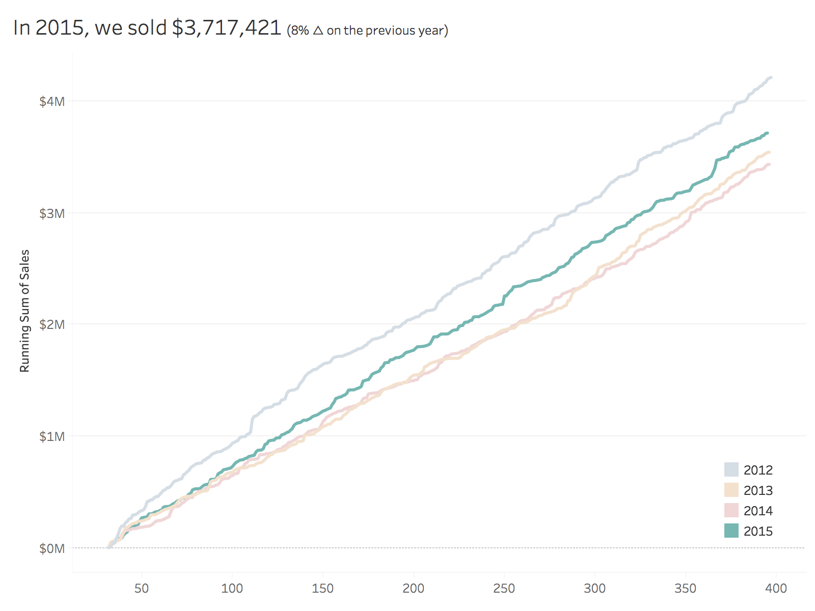


SECOND ATTEMPT
To format the scale, I first changed the number format to mmm to give me month abbreviations. That gets me close, but some months are missing and the months are labeled at the middle of the month whereas Emma's are labeled at the start of the month.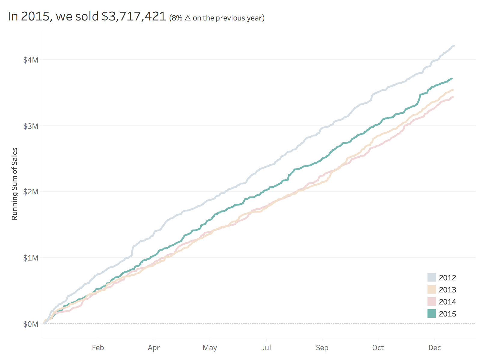


THIRD ATTEMPT
I sent Emma a message with a few questions, basically because I was stuck. All she said was:You'll have to re-think the date you have on the x-axis so you can also colour by year.
What does that even mean? I'm beginning to get a sense for the sort of torture I put people through. Ok, so I somehow need to get my x-axis to act like a date, yet still be able to show every day for each year in the view. I also need it to only be month and day. Hmmm: Hey Google, can you help?
Yes indeed! I searched for "tableau month and day of year" and the second search result took me to the Forums which had exactly the question I was asking. The brilliant Jonathan Drummey came up with this formula:
DATE(DATEADD('day',DATEPART('day',[Date]),DATEADD('month',DATEPART('month',[Date])-1,#1903-12-31#)))
Sweet! All I needed to do was swap out [Date] for [Order Date] and I was good to go. Now I have the exact result I needed.
Awesome challenge! I love learning something new! Here's my final product.
January 24, 2017
Tableau Tip Tuesday: Two Use Cases for the New DateParse Feature
Tableau 10.2 is bringing us a new date parse feature. I had two perfect uses cases for this to give it a test. The first is file of WhatsApp messages that requires both splitting and a dateparse. Previously this had to be done either in Alteryx or via a split, then a complicated calculation.
The second example is the data set used in Makeover Monday week 3. If I had the dateparse feature when I created the Tableau extract, I wouldn’t have messed up the data for everyone.
No workbook to accompany the video this week. This short video itself should give you a good idea for how dateparse works.
May 17, 2016
Tableau Tip Tuesday: How to Create Monthly Radar Charts

In this week’s Tableau Tip Tuesday, I show you how to create radar charts that are based on monthly data. That is, the months go around an imaginery circle like a clock. Thanks to Jonathan Trajkovic for this great explanation and to Ed Hawkins for the inspiration.
May 15, 2016
Makeover Monday: How warm is Earth becoming?
There was a lot of chatter on Twitter last week about this terrific visualisation by Ed Hawkins:
Spiralling global temperatures from 1850-2016 (full animation) https://t.co/YETC5HkmTr pic.twitter.com/Ypci717AHq
— Ed Hawkins (@ed_hawkins) May 9, 2016
The beauty of this visualisation is in the animation. However, without the animation, it kind of fails to tell the story. Let’s dig a bit deeper.
What works well?
- There is a clear title.
- The background circles provide helpful context.
- Including the month labels makes it easier to understand what you’re seeing.
- The year in the middle helps tell the story.
- The animation is compelling.
- It has a nice color scheme that works well on a black background.
What could be improved?
- While the title is clear, it could be more eye-catching, like a news headline.
- If you see this as a static image, you lose the sense of change.
- You can’t compare any time periods. All you know is 2016 is the warmest.
- There’s no explanation about what the numbers represent. Though I do see in the Twitter post a link to additional information.
- The color scale has nothing to do with the temperature change, which I assumed it did until I read hte additional information. The colors actually represent the years. That doesn’t add much value. I think coloring by the temperature change would be more impactful.
So, this data set is actually incredibly simple. All we have is one record per month, the temperature, and the confidence intervals.
The first thing I wanted to do was rebuild the radial chart. This wasn’t nearly as easy as I thought. This post by Jonathan Trajkovic was very helpful, but it wasn’t designed for months. I’ll record how I did made it for a future Tableau Tip Tuesday.
 |
| Click the image for the interactive version |
This radial chart is basically the same as the original, however I can’t make it “play”on Tableau Public and I also changed the color to be the median temperature difference. Really, I only built this to see if I could. It’s not any more useful than the original.
Next, I took the radial chart and flattened it out.
 |
| Click the image for the interactive version |
This doesn’t make the understanding all that much easier because I can’t tell which years are which. Maybe I should switch the color legend back to years?
 |
| Click the image for the interactive version |
Oh wow! What a difference! Now I can easily see the distinction between the older and more recent years. I think this is much, much better than the original, especially in static format. I wanted to keep iterating though.
Whenever I’m working with time-based data, I like to build either calendar heatmaps or heatmaps by year and month. Here’s what this data set looks like as a heatmap:
 |
| Click the image for the interactive version |
The heatmap makes the series of lines even easier to understand. It’s super easy to see the gradual temperature change over time. This is pretty compelling, yet I wanted to keep going. Was there a better way to tell the story?
Next I looked at the 10-year average, that is, a 120 month moving average of the median temperature change. I then overlaid the confidence intervals.
 |
| Click the image for the interactive version |
Lastly, I took the 10-year moving average view and replaced the monthly confidence intervals for the monthly values while keeping the overall 10-year average. This is my submission for Makeover Monday. In this view, I like how I can see the drastic monthly fluctuations but still have the overall context. Including a reference line at zero helps emphasize the dramatic change since about 1984.
I also included a strip plot under the graph that shows the average median temperature difference for the entire year. This brings back a bit of the heatmap view above.
In the end, another fun week with a simple data set that provides lots and lots of options. Which one do you like best?
UPDATE: This week has been a fascinating exercise in iterating. That’s the beauty of Tableau. I can get another idea and build it quickly. After seeing some of the submission for this week, I thought a jitter plot might work well. Thoughts?
 |
| Click the image for the interactive version |
April 19, 2016
Tableau Tip Tuesday: Using LOD Calcs to Filter the Latest Month and View Sales for the Latest Day
I’ve written before about making the ends of sparklines actionable here and here and created a video here. Each of these uses table calcs to add the dot on the end of the lines. The problem, though, is the method falls apart when the end date on all of the lines isn’t the same. Yes, there are other workarounds with table calcs, but they are overly complicated.
I’ve been wanted to look at this again with level of detail expressions, thinking there had to be a simpler way to create and maintain them, and a way to overcome the drawback listed above. The video below walks through two level of detail expression:
- Create a filter using a LOD calc to dynamically return just the latest month in the data set
- Return the value of the end of EACH line of a series of sparklines
This technique could easily be parameterized, but for this example, I stick to a single dimension. Enjoy!
November 9, 2014
Tableau Tip: KPIs and Sparklines in the Same Worksheet
Anyway, as I was on the plane, I thought it would be great to kick off the week with a new tip. Today, I'm writing about combining KPIs and sparklines in a single view. It's very common for business users to want to see KPIs and trends in the same view. These give them a sense for the overall direction of their product and also highlight the most meaningful numbers to them. I often see people create these as separate worksheets in Tableau, but with this post, I'm going to show you how to combine them into a single view.
Combining them into a single view provides a couple of benefits:
- Tableau only needs to render a single sheet, so until parallel processing comes out in v9, you'll see a performance benefit.
- If you have a hierarchy, then expanding the hierarchy will keep the table and the sparklines together.
- Trading volume for the last 7 days
- Trading volume for the prior 7 days
- Week over week change (raw & %)
January 24, 2014
Tableau Tip: Showing all dates on a date filter after a Server refresh
I saw on this thread that it’s still an unsolved problem. In a nutshell, here’s a summary of the problem:
- You created a dashboard that has a date slider quick filter and you’ve told Tableau to use all dates.
- The next day when the data source refreshes, the quick filter doesn’t automatically include the new date(s). The slider has to be manually moved to the right to accommodate for the new data.
Let me first explain the problem in a bit more detail. Assume that you have a set of sales data for the first few days of the year.

And you built a cool dashboard with a date slider like this:
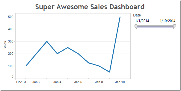
You publish the dashboard to Tableau Server and set the data source to refresh each night. But when you look at it a couple of days later, you notice that the chart hasn’t changed.
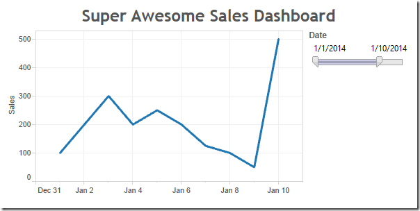
You can clearly see that four more days should be included, but the slider is still stopped at January 10th. Tableau does not automatically adjust the date slider; it stays at whatever dates were picked when you published the workbook.
That leaves you with two options, both of which are not satisfactory:
- Republish the workbook every day.
- Tell your users that they have to adjust it themselves every day.
Step 1: Create a parameter that allows two options and show the parameter control.

Note from Joe: This allows us to default the view to including all dates, while enabling the interactor to decided to apply a date filter.
Step 2: Duplicate the data source (or alternatively create a data source that has only the dates since that’s all you need to make this work, or you could use custom SQL like “SELECT DISTINCT Date FROM Table”)
Note from Joe: This will give us a data source with a valid date range, a kind of dynamically populated parameter.
Step 3: Unlink the Date field in the secondary data source. Ignore any warnings.

Note from Joe: This way there is no Group By clause sent in the query to the secondary date list data source.
Step 4: Create a calculated field that checks for matching dates.
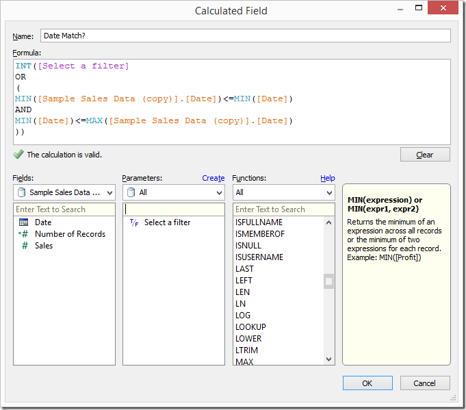
Step 5: Replace the Date filter on the worksheet from the primary data source with the Date field from the secondary data source and show the quick filter. Again, ignore any warnings.

Note from Joe: The combination of this calculated field in the primary data source, and a filter on the Date field directly from the secondary data source, is where the magic happens. The filter on Date that we just placed will happen in the query to the secondary data source, then the aggregations to get the MIN and MAX Date in the secondary, and then the comparisons that happening the formula will happen after the results are returned from each data source. This is effectively enabling us to get the selection of the filter available to use in the calculated field.
Step 6: Add the date match calculated field that you created in Step 4 to the Filters shelf and set it to At Least 1.
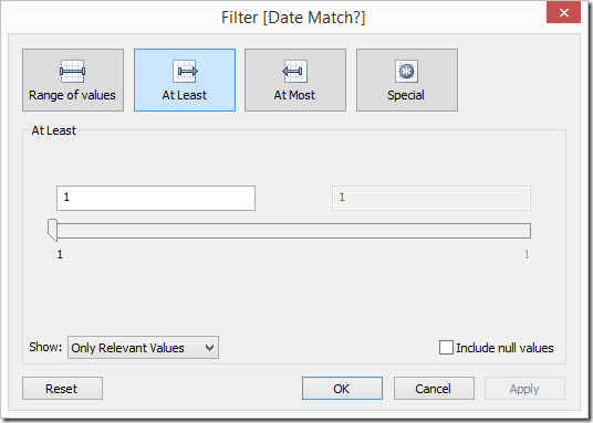
Note from Joe: The INT() in the formula turns the Boolean value into an integer because a Boolean cannot be Continuous and Tableau cannot filter on a Discrete Measure if it is not a table calculation. So by changing the data type, we can make the pill a Continuous Measure and filter on it.
Step 7: Clean up the dashboard – Remove the quick filter that is showing, add the quick filter for the Date slider and show the parameter control.
When you publish the dashboard, be sure to pick All Dates from the parameter created in Step 1 above. The Date slider will still not move, but at least we are now defaulting the dashboard to always show all dates and then the user can filter if they wish.
December 4, 2013
Tableau tip: Don’t waste the ends of your sparklines…make them actionable!
Sparklines are one of my favorite chart types to include in dashboards, yet I see many people using them without providing enough context. Some people like to add bandlines, some like to add sets of dots, some like to add text, all in an effort to add meaning to sparklines. These are perfectly fine, but I think there’s a better way to make sparklines actionable. Is this the best way? Maybe not, but it is an alternative worth considering.
Sparklines were first introduced by Edward Tufte in his book Beautiful Evidence. Tufte says: “A sparkline is a small intense, simple, word-sized graphic with typographic resolution.” Stephen Few expands Tufte’s definition in his book Information Dashboard Design: “Their whole purpose is to provide a quick sense of historical context to enrich the meaning of the measure. This is exactly what’s required in a dashboard.”
When someone is creating a dashboard, they should provide as much information and meaning as possible to make the information actionable. I don’t see any examples from Tufte, Few or Jim Wahl that provide much meaningful context to the end of a sparkline.
Tufte provides some examples:
He might add a red dot to the end of the line along with some text to highlight the latest value.
While it’s a bit tough to see in this next example, Tufte has used red dots for the beginning and ends of the lines and blue dots to indicate the highest and lowest values.
It’s important to also note how Tufte always includes the values associated with all of the highlighted dots.
There are tons and tons of examples of how Stephen Few uses sparklines. Consider this example from his whitepaper Dashboard Design for Real-Time Situation Awareness.
Few says: “Meaningful context has been added to these metrics in the form of sparklines, which provide a quick sense of the history that has led up to the present.” This small section of a dashboard is a classic Few design. You’ll often see him use (1) sparklines, (2) a visual indicator of health (the red dots in this case), and (3) bullet charts closely together.
When I use sparklines, I like to combine all of the elements of Tufte and Few designs. Let’s look at an example.
On the left you see the sparklines, but notice that I use the dot on the end of the line as an indicator to take action. Tufte uses the dot one the end to indicate you’re at the end. Does that make it actionable? Not necessarily. Few separates the indicator into its own space and does not mark the end of the sparkline. My version saves space, increases the data-to-ink ratio, and provides a visual indicator to the reader in one chart.
The table to the right summarizes the sparkline, pulling from Tufte’s practices. In this example, I’m concerned with comparingthe last two 7-day periods. Notice how I used conditional formatting so that the dot on the end of the line is the same color as the text in the WoW and WoW% columns. I don’t use bullet graphs because I feel that the text itself is sufficient; I don’t want to add a graph for the sake of having a graph for everything.
Simple, concise, actionable…all things you want in a dashboard. Keep reading to see how I built these sparklines in Tableau.
Step 1: The date calculations I use in the example below are simple and efficient when you include a Max Date field in your data source. Creating Max Date as a calculated field directly in Tableau won’t always work since you need the Max Date at the row level. In this example, I’ve switched the Superstore Sales data source to Custom SQL and added a subquery to include the Max Date at the row level.
TIP: If you have a large dataset, Tableau will run more efficient queries if you push the custom SQL into a view in your database. Tableau wraps its own SQL around the custom SQL, which can get quite messy and inefficient. Creating a view will simply the query Tableau runs and improve performance.
Step 2: I like my sparklines to show the last 30 days, so I need to include a date filter. I include my date filter as the first step so that my data set is smaller to work with from the outset.
A Boolean calculation works well here. Notice how it leverages the Max Date field. This wouldn’t work if the Max Date was a calculated field inside of Tableau.
To get my sparklines to look how I like them, the column and row shelves will need to look like this. Let’s break the worksheet down into its pieces.
Step 3: Create a dummy header and place it on the columns shelf. Place it on the Columns shelf and hide the fields labels for the columns.
Step 4: Right-click-drag Order Date to the columns shelf and choose the first option, Order Date (Continuous). Notice how it only shows the last 30 days.
Step 5: Right-click on the Order Date pill and uncheck Show Header. This hides the date axis.
Step 6: Drag Category on the Rows shelf and hide the headers. The headers aren’t needed since they’re on the left side of the table; there’s no need to repeat them.
Step 7: Place Sales on the Rows shelf to the right of Category. This gives us the lines. Make them thinner, change the color to dark gray, and resize the chart to make them look like sparklines.
Step 8: Double-click on the Sales axis to bring up the axis options. Uncheck Include Zero and choose Independent axis ranges for each row or column. This gives us the view that best fits the space. Few talks about the scaling options for sparklines in Chapter 10 of Information Dashboard Design.
Step 9: We need a calculated field to show a dot on the end of the line. You might be tempted to simply turn on the line ends, but that won’t do the trick because you can’t color the line ends only. The calculated field should only capture sales for the last day. This is where our Max Date field comes in handy again.
Step 10: Drag the new Last Day Sales field onto the Rows shelf to the right of the Sales pill. Right-click on the Last Day Sales pill and choose Dual Axis. Right-click on the scale for Last Day Sales and choose Synchronize Axis. Right-click on Sales pill and uncheck Show Header.
We’re almost done. All we need to do now is color the dot.
Step 11: I like my dots to be colored by the week over week change. This requires me to create several calculated fields. You could combine all of these calculated fields into a single calculation, but I like separating the parts of the calculation to make it easier to understand and so that each calculation is reusable.
Create all of these calculated fields in this order (special thanks to Joe Mako for helping me get these calculations working and showing me why they’re more efficient than what I had been doing):
- Last 7 Day Sales:
IF [Order Date] >= DATEADD('day', -6, [Max Date]) THEN [Sales]
END - Prior 7 Day Sales:
IF [Order Date] >= DATEADD('day', -13, [Max Date]) AND [Order Date] <= DATEADD('day', -7, [Max Date]) THEN [Sales]
END - Total Sales - Last 7 Days:
IIF(LAST()=0, RUNNING_SUM(SUM([Last 7 Day Sales])), null) - Total Sales - Prior 7 Days:
IIF(LAST()=0, RUNNING_SUM(SUM([Prior 7 Day Sales])), null) - WoW (week over week):
[Total Sales - Last 7 Days] - [Total Sales - Prior 7 Days] - WoW %:
[WoW]/[Total Sales - Prior 7 Days]

Step 13: Right-click on the WoW % pill, go down to Compute Using and choose Order Date.
Step 14: Double-click on the color legend and change the settings to something like these:

You might need to do a bit more formatting to get your viz just the way you want it, but in the end, you’ll want it to look something to this:
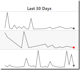
Notice that I keep the row banding. I like to include banding on both the sparkline chart and the table so that the reader’s eyes go across the dashboard.
This might seem like a lot of steps, but once you do it a couple of times, it’s pretty quick; you’ll be able to do this in only a couple of minutes.
Building the table is super simple now that you have all of the calculations (this is why I create all of them individually). Download the workbook here to see how all of this was built.


