January 6, 2023
How to Create a Two Color Area Chart in Tableau
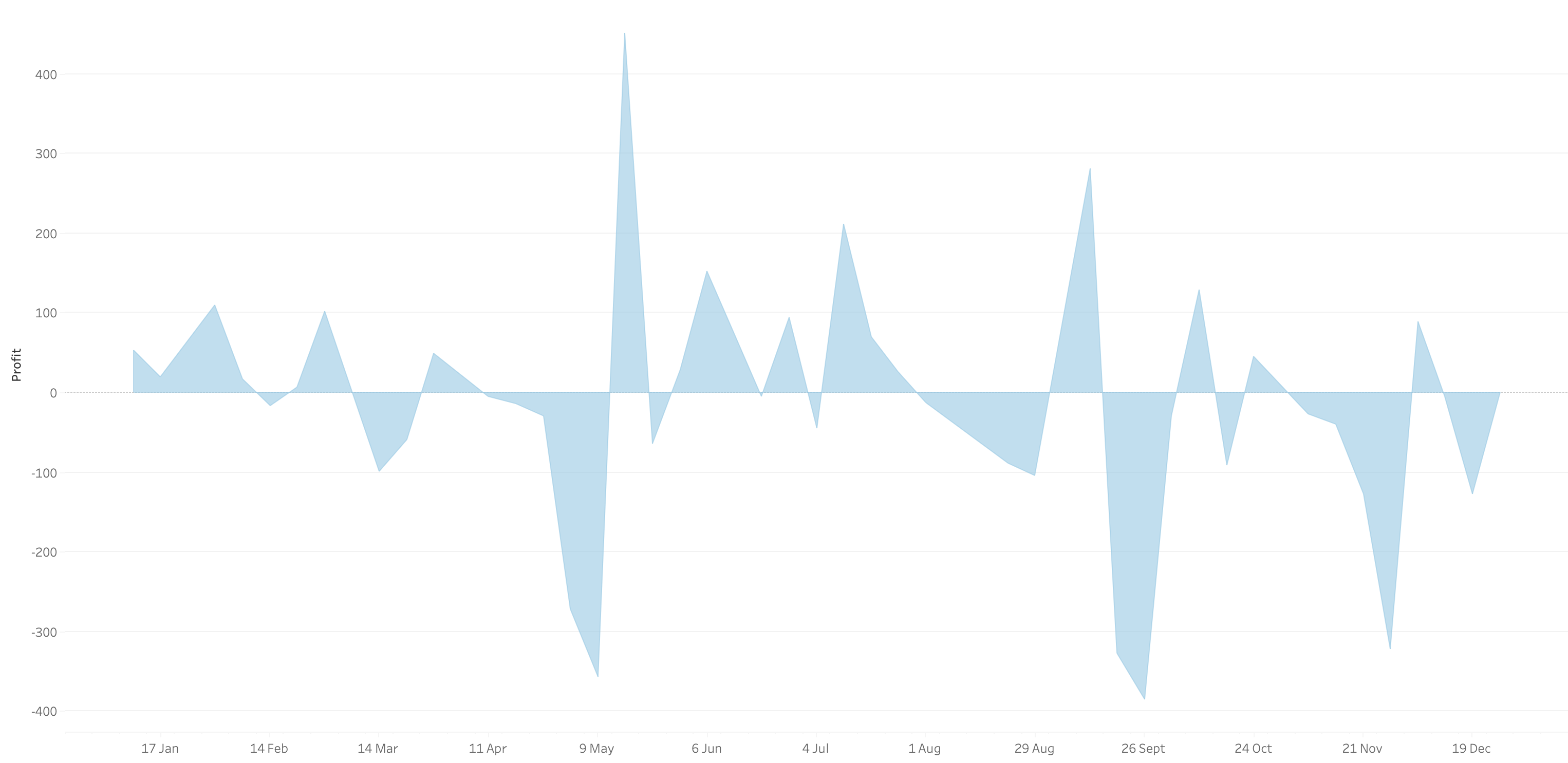
In this week's Watch Me Viz, I showed the problem this tip helps solve. An area chart in Tableau only allows a single color. Like this…

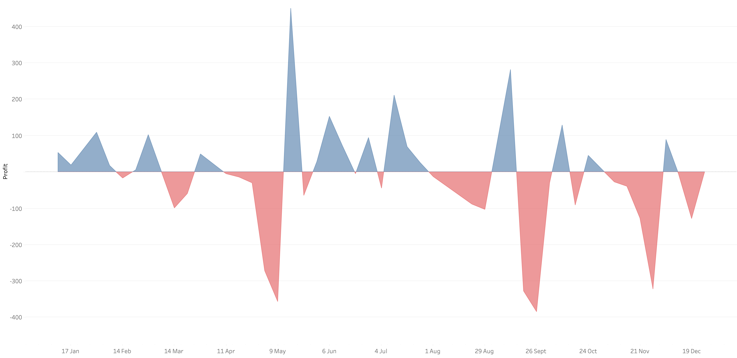
What we want is an area chart like this with two colors.

In 9 simple steps, I’ll show you how to build it. Follow along with the video. The 9 steps are listed at the bottom of this post.
STEPS
1. Create the area chart
2. Show what happens when you add a profit to color - you only get one color
3. Duplicate the measure
4. Fix the axes
1. Top axis starts at 0
2. Bottom axis ends at 0
5. Choose a color for each area chart
6. Format the axes to get rid of 0
7. Add reference lines to scale the charts relative to each other
1. WINDOW_MAX(ABS(SUM([Profit])))
8. Duplicate for the negative reference line
9. Formatting
February 22, 2022
How to Displays Multiple Measures on Multiple Rows
September 7, 2021
How to Create a Bar Chart Without an Axis
Did you know you can create a bar chart without using the rows or columns shelf? Check out this super simple tip to see how it's done.
July 6, 2021
How to Disable Sorting on a Worksheet
August 20, 2020
How to Hide Only Zero from the Axis Labels

Sometimes you don't want to show the zero label on an axis, but you still want to show all of the other axis labels. In this video, I show you how to do it.
Special thanks to Jeff Shaffer for showing me this trick during one of our TC Speed Tipping sessions.
December 3, 2019
#TableauTipTuesday: How to show axis marks only at the top of a scatter plot

In this week's tip, I show you how to show the axis of a scatter plot only on the top of the view. Tableau doesn't provide an option to move the axis to the top, so this trick shows you a simple workaround.
Enjoy!
March 21, 2017
Tableau Tip Tuesday: How to Create a Full Year Heatmap Calendar with Month Labels
June 17, 2015
Tableau Tip Tuesday: Showing an Axis Above a Chart
When I was working on solving this, I started by looking at the XML for a workbook and there is a bit of code that controls whether an axis displays. I built a dual-axis chart to see if I could change the display in the code.
In the <style> section, note the value=‘false’ setting. This is what is hiding the axis. I changed only the top axis by setting it to ‘true', but when I opened the workbook again, both axes were displayed. Back to the drawing board I went.
Here are the steps to follow to display the axis above the bar chart and not below (sort of):
Step 1: Create a bar chart.
Step 2: Duplicate the measure that is shown in the chart by right-clicking on the measure in the Measures list and choosing Duplicate.
Step 3: Drag the duplicated measure onto the secondary axis.
You should now have a chart that looks like this:
Step 4: Change the mark type for both measures to Bar.
Step 5: Remove the Measure Names field from the Color shelf. This isn’t required, but you really don’t need to have two colors for the same measure.
Step 6: Right-click on the bottom axis and choose Format. Change the Font to white and set the Ticks to ‘None’. This doesn’t hide the axis (hence the reason I said ’sort of’ above), but it will give the appearance that the axis isn’t there.
Note: The reason that you have to duplicate the measure has to do with how formatting works. If I used the same measure again for the secondary axis (i.e., Sales in this case), then when I format Sales, it applies to both axes. However, when you duplicate the field, Tableau treats it like a totally separate measure with its own formatting.
Step 7: Double click on each of the axes and remove the titles. This isn’t required, but it makes the axis narrower.
That’s it! While this isn’t a perfect solution, it works. Also, be sure to clean up the tooltips since they will show the measure twice.
You can download the workbook used to create this viz here.
December 1, 2014
Makeover Monday: What it feels like when a bar chart doesn't start at zero

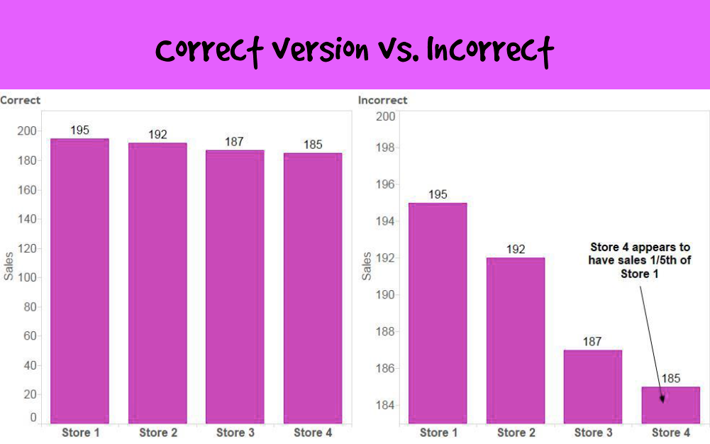
Victor provided the following two examples:


Victor's explanation about why these don't work:
The primary problem with these graphs is that they visually misrepresent the truth. They mislead the viewer by manipulating the data.
The primary misrepresentation involves the use of a non-zero baseline. If you look at the vertical axes on all of these bar graphs, you'll notice that none of them start at zero. This would be fine if lines or dots were used to encode the values, but because the length of the bar encodes its value rather than just the position of its endpoint in relation to the quantitative scale, the use of a non-zero baseline doesn't work. By starting the quantitative scale above zero, the relative differences in the values represented by the bars have been exaggerated.Additional references:
http://www.perceptualedge.com/example14.php
http://www.excelcharts.com/blog/of-bars-and-lines/


