April 28, 2014
Makeover Monday: What a beer will cost you at every Major League Baseball stadium

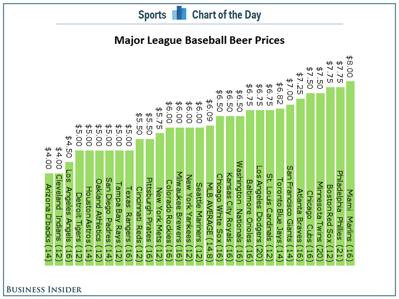
Anyone that goes to a professional sporting event in the US knows how ridiculously expensive it is to enjoy some frosty goodness at the game. Cork Gaines of Chart of the Day created this bar chart to show the most expensive beers in Major League Baseball stadiums.
The basic problems:
- As always, Cork has sorted the chart in the wrong order. Sorting should be based on what you want to emphasize. In this case, the story is about the most expensive beers, so the bars should be sorted in descending order.
- A horizontal bar chart would be much easier to read.
- Since the beers are not all the same size, it might make more sense to show an alternative view of cost per ounce.
Here's my alternative, created with Tableau for Mac.
I've not only addressed the issues I outlined, but I've also made it interactive. You can now answer more questions. Perhaps you're more interested in where you can find the cheapest beer or the best deal (per ounce). This is a much more informative version than Cork's.
Have a better way to display this data? Download the data here and the workbook here and leave a link in the comments.
April 26, 2014
Makeover Friday: Chart of the Day's NCAA Basketball Championships
This week, my inspiration comes once again from Cork Gaines of Business Insider Sports. I also knew since it was getting late that it wouldn't take me long to find something on their blog that needed a makeover. Cork presented the chart below, which shows the NCAA Basketball Championships won since 1939 broken down by gender.
Some problems immediate jump out:
- The chart is sorted backwards. The purpose of this chart is to emphasize the schools with the most titles, so they should be listed first.
- You have to turn your head sideways to read the school names. Horizontal bars would be better.
- He's trying to show both men's and women's championships together, yet the date ranges aren't the same for both genders. To make it an apples to apples comparison, I would start my men's titles at 1982 as well.

Download the data here and the workbook here (requires Tableau 8.2 beta - I made this with Tableau for Mac)
April 25, 2014
Coming to TCC – Move Fast & Count Things: Doing Tableau the Hacker Way

I’m super excited to announce that Bryan Brandow and I will be setting the stage on fire at TCC14 in Seattle. This promises to be one of the best sessions you will ever experience at any TCC. If you thought our presentations in the past were good, you’re really in for a treat!
For those of you that don’t know Bryan, he’s basically the equivalent of a Tableau Zen Master for MicroStrategy. It’s been amazing working with him these past two years and seeing how he has taken to Tableau and the impact that change has had one his career and his passion. In addition to Bryan and myself, our entire Facebook Data Viz team will be in attendance and everyone is contributing topics to this presentation.
Synopsis:
"The Hacker Way is an approach to building that involves continuous improvement and iteration. Hackers believe that something can always be better, and that nothing is ever complete. They just have to go fix it -- often in the face of people who say it's impossible or are content with the status quo." - Mark Zuckerberg.
In a Tit for Tat format much like Laurel and Hardy, Bryan and I will take you at breakneck speed through Facebook's incorporation of the "Hacker Way" into Tableau to do things no one thought was possible. We will be demonstrating some open source tools that we've built to make Tableau do things never thought possible and reveal a selection of top hacks that our teams have come up with that will help every Tableau user push their dashboards and servers to the limit. This session will be wall to wall packed with laughs, learnings and “how’d they do that?” moments. The pace will be fast, but step by step details of how you can implement everything you see will be available online immediately following the show.
We’re very excited and have some pretty big surprises in store :)
About Us:
 | I (Andy Kriebel) am a Tableau Zen Master as well as a Data Visualization Guru and Tableau expert at Facebook. My foray into data visualization began with building project management dashboards for teams in Vietnam in 2005. My passion exploded when I began using Tableau in 2007. Since then, my drive has led to a life-changing opportunity at Facebook. In August 2009 I launched this blog (vizwiz.blogspot.com), which provides examples of data visualization best practices, methods for improving existing work, and tips and tricks with Tableau Software. |
| Bryan Brandow is a Data Visualization Engineer at Facebook. He is the author of Bryan’s BI Blog (www.bryanbrandow.com), which is a popular blog for MicroStrategy hacks that has recently expanded to follow his journey into pushing the limits of what’s possible in Tableau as well. Bryan has been on an amazing journey from MicroStrategy to Tableau, which he speaks a bit about in his amazing blog post “Evolving BI”. |
April 18, 2014
Chart makeover: Business Insider’s Ringed Donut Chart
It was April Fools’ Day. I was reading a chart from Business Insider with the bold title “The Mobile Web Is Dead, It's All About Apps” and I thought for sure they were messing with me.
They published this chart that I could only think of calling a ringed donut:
I pondered…Are they messing with me on purpose? Are they taunting me? But then I remembered that it’s Business Insider and nearly of their charts are terrible. I studied the chart for a few minutes before I even noticed that there was the black ring around the donut that summarized the slices of the donuts. Whoa, that’s confusing! And besides, who would ever slice up a tasty donut?
I re-created the data in Excel (get it here) and created this version with Tableau for Mac.
Ah, much better!
Notice that I kept the bars at scale across Apps and Browsers; this helps to emphasize how little time people spend on mobile browsers. And if you look at social apps, you can see that people spend way more time on Facebook than Twitter. I’m just sayin’!
Download the workbook here (requires Tableau 8.2).
April 12, 2014
Tableau Tip: Moving reference lines behind bars
Reference lines are wonderful. If done well, they can add so much context at a glance with very little effort to include them in your viz. However, reference lines in Tableau always sit on top of the rest of the viz. We may not want them to be so prominent though.
Wouldn't it be great if we could place them behind the bar, kind of like how you can decide which objects to move backwards on a PowerPoint slide?
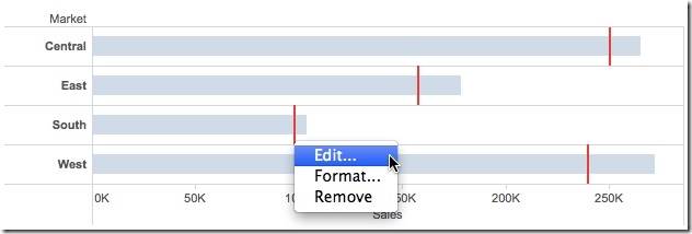
First, let's build a simple bar chart of Sales with a reference line for Budget Sales.
If we click on one of the reference lines and then right-click, we don't have an option to move the marks to the back.
There's a super simple trick to move the reference lines to the back...Gantt bars!
April 9, 2014
Tableau Tip: Analyzing Year over Year Trends with Table Calcs
UPDATE – 10-Apr-3014:I received some feedback from both Jonathan Drummey and Joe Mako about this blog post and some of its inaccuracies. There are a couple of key notes:
- My intent was to show how you can compare the 7-day averages of two time periods. In this example, I’m calling this a Year over Year calculation, but really it’s a comparison versus 365 days ago. Small, but important distinction.
- The Superstore Sales data set has days that are missing, so unless you turn on domain padding, you won’t be comparing the prior 365 days that you’re expecting to compare. I’ve updated the post below.
- Like most things in Tableau, there are many ways to solve the same problem. Joe pointed out some things he would have done differently with the calculations. While neither of us is wrong, note that you should always look for ways to be more efficient.
April is #TableauTipsMonth, so I thought I would pick something from my backlog and get to it. Today I’ll be writing about a fairly typical scenario:
- Your data is cyclical through the week
- Daily numbers vary wildly, so smoothing is necessary
- You need to compare to the same period from the prior year

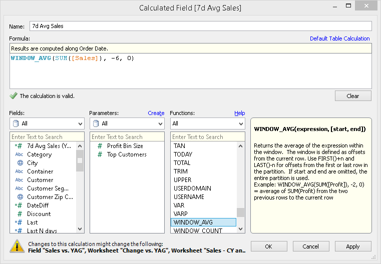
This data set looks like it might be cyclical, so let’s apply a 7-day average calculation to it. We could do this via the quick table calculations on the pill, but we will want this calculation for later. Right-click on Sales in the Measures pane and choose Create Calculated field. Build this calculation:
Here’s what the chart looks like if I filter Order Date to 2013 on the Filter shelf (I’ve focused in on January):
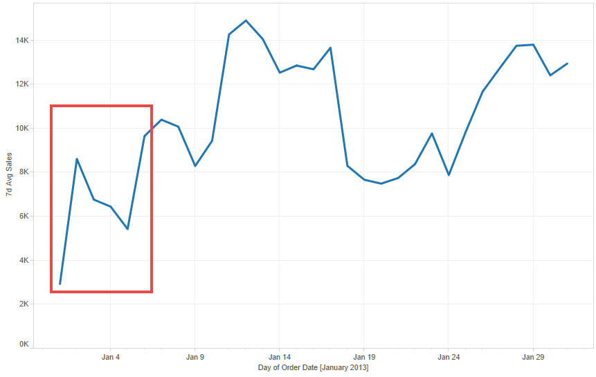
Since I have filtered the year of Order Date to 2013 by dragging the Order Date pill onto the Filters shelf, Tableau first ran a query that returns only results for 2013 and then it will do the 7-day average calculation. We don’t want that because the first six days of 2013 will be wrong. They are wrong because they don’t contain a full 7-day date range.
To fix this, we need to change the calculation. Notice that I’m not passing a filter to Order Date inside the calculation. By passing the filter in the table calc, Tableau will return all of the data for all years, then the table calc will running after the database query, which will then provide the full date range for the 7-day average to calculate correctly.
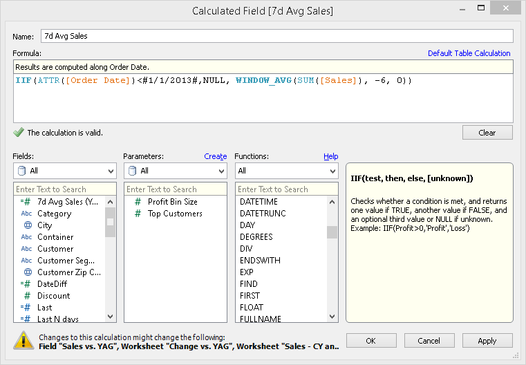
And this is what the chart looks like if filter the data via the table calculation (of course you have to remove Order Date from the Filters shelf):

Quite a different story. The lesson here is that you need to understand how Tableau is filtering the data. Anything on the Filters shelf will filter the data before any table calcs are performed.
One thing to note, though, is that this data set does not include all dates. Therefore, we need to turn domain padding on by right clicking on the Order Date pill and checking the “Show Missing Values” option. Notice how there are now gaps in the line; that’s because Tableau is filling in the missing dates for us.
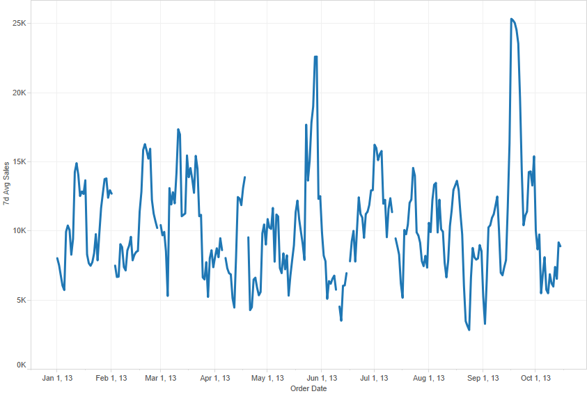
So that covers our 7-day average. To calculate the 7-day average for the same 7-day period 365 days ago, we only have to make a simple adjustment to the 7-day average calculation we’ve already created.
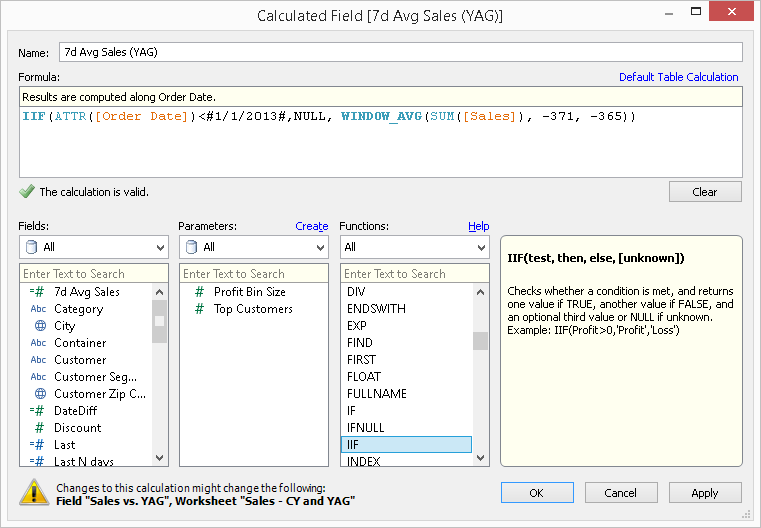
The only change is the start and end period inside the WINDOW_AVG function. Now drag the new measure onto the same axis as the 7-day average.

So now we can see how the 7-day average on an day compared to the 7-day average 365 days ago. Perfect!
Now that we have these two table calcs, we can easily compute the change between the two dates periods with another calculated field:

Drag this new measure onto the Rows shelf. Clean it up a bit, and we now have a nice view that answers a simple question: How are sales performing compared to last year?

Notice that I used an orange-blue color palette for the comparisons to the prior 365 day values. This is a good practice to employ because the colors corresponding with the colors for each line. If the bar is orange, then last year performed better and vice versa.
Download the workbook used in this example here.


