January 31, 2014
A map is better than a table: When is it best to buy gas in the USA?
If you want to find the cheapest gas in your area, you should check out GasBuddy. A couple of days ago on their blog they published a simple study they did that includes a table for the best times to buy gas by state. This table is great for looking up your individual state, but it’s impossible to see any patterns in the data.
I recreated the data in Excel and opened it up in Tableau. The first thing I noticed is that the data seemed too sporadic for me, so I took the liberty of grouping the data into four buckets: Early week, mid-week, late-week and the weekend. In less than 5 minutes, I had this map.
Now it’s much easier to see that in the majority of the US, you’re going to find the cheapest gas on the weekend. It’s much tougher to discern that from their table. Click on the color legend or the table to highlight.
January 24, 2014
Tableau Tip: Showing all dates on a date filter after a Server refresh
I saw on this thread that it’s still an unsolved problem. In a nutshell, here’s a summary of the problem:
- You created a dashboard that has a date slider quick filter and you’ve told Tableau to use all dates.
- The next day when the data source refreshes, the quick filter doesn’t automatically include the new date(s). The slider has to be manually moved to the right to accommodate for the new data.
Let me first explain the problem in a bit more detail. Assume that you have a set of sales data for the first few days of the year.

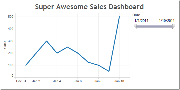
And you built a cool dashboard with a date slider like this:

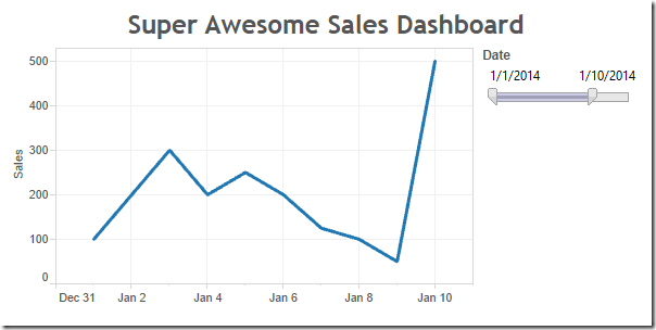
You publish the dashboard to Tableau Server and set the data source to refresh each night. But when you look at it a couple of days later, you notice that the chart hasn’t changed.

You can clearly see that four more days should be included, but the slider is still stopped at January 10th. Tableau does not automatically adjust the date slider; it stays at whatever dates were picked when you published the workbook.
That leaves you with two options, both of which are not satisfactory:
- Republish the workbook every day.
- Tell your users that they have to adjust it themselves every day.
Step 1: Create a parameter that allows two options and show the parameter control.

Note from Joe: This allows us to default the view to including all dates, while enabling the interactor to decided to apply a date filter.
Step 2: Duplicate the data source (or alternatively create a data source that has only the dates since that’s all you need to make this work, or you could use custom SQL like “SELECT DISTINCT Date FROM Table”)
Note from Joe: This will give us a data source with a valid date range, a kind of dynamically populated parameter.
Step 3: Unlink the Date field in the secondary data source. Ignore any warnings.

Note from Joe: This way there is no Group By clause sent in the query to the secondary date list data source.
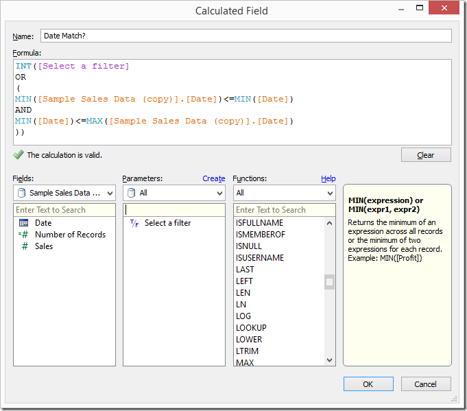
Step 4: Create a calculated field that checks for matching dates.

Step 5: Replace the Date filter on the worksheet from the primary data source with the Date field from the secondary data source and show the quick filter. Again, ignore any warnings.

Note from Joe: The combination of this calculated field in the primary data source, and a filter on the Date field directly from the secondary data source, is where the magic happens. The filter on Date that we just placed will happen in the query to the secondary data source, then the aggregations to get the MIN and MAX Date in the secondary, and then the comparisons that happening the formula will happen after the results are returned from each data source. This is effectively enabling us to get the selection of the filter available to use in the calculated field.
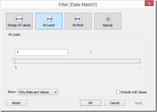
Step 6: Add the date match calculated field that you created in Step 4 to the Filters shelf and set it to At Least 1.

Note from Joe: The INT() in the formula turns the Boolean value into an integer because a Boolean cannot be Continuous and Tableau cannot filter on a Discrete Measure if it is not a table calculation. So by changing the data type, we can make the pill a Continuous Measure and filter on it.
Step 7: Clean up the dashboard – Remove the quick filter that is showing, add the quick filter for the Date slider and show the parameter control.
When you publish the dashboard, be sure to pick All Dates from the parameter created in Step 1 above. The Date slider will still not move, but at least we are now defaulting the dashboard to always show all dates and then the user can filter if they wish.
January 23, 2014
The Victors & the Quitters: Who completed the 30-day pushup challenge?
During the first week of December, I posted a question on Facebook asking who might want to do a 30-day pushup challenge. I didn’t expect very many takers, however 33 people took on the challenge. The challenge seemed simple: 100 pushups per day for 30 days. But it wasn’t as easy as it seemed. Only 3 of 33 completed the challenge.
How did everyone do? Check out the viz below to find out.
January 21, 2014
Spreading the gospel, one data viz nerd at a time
Fact: If I didn’t start my blog, I wouldn’t be working at Facebook.
When Facebook was looking for people to build out their new Tableau team, naturally they started scouring the web to find people that could make an impact. The only reason Facebook knew I existed was because I write my blog. That brings me back to the beginning…how did I get started and why?
Back in September 3, 2007, in no less than one hour, I:
- Ran a Google search for dashboard software
- Downloaded and installed Tableau 3 (people new to Tableau have no idea how good they have it now)
- Watched the first two intro training videos
- Created my first dashboard
That one hour changed my life. I became seriously OCD about Tableau and data visualization.
Almost another two years passed. I had been reading tons about data visualization, but there were very few blogs about data viz or Tableau and Tableau Public didn’t exist. I had been practicing a lot, I loved writing and I needed a way to document my work. I wasn’t even considering that other people might actually read it; the blog was like a diary after all.
There was a void, so I created vizwiz.blogspot.com. I chose to host it on blogger for no other reason than I was already using it for my personal blog and it’s super simple.
I started the blog as a place for me to take existing charts and graphs I found on the internet and transform them into something more meaningful. My first blog post on August 17, 2009 was a remake of our friend the pie chart.
People were starting to read my blog more (particularly after the Huffington Post mentioned my post about birthdays). I had a small following on my blog, but I wanted more people to know that I had content to share that they might be interested in. After all, one of the best things about the Tableau community is the willingness of people to share their knowledge.
Facebook and Twitter are embedded in our every day lives and are the two best ways to spread a message, so I adjusted my creation flow for blog posts to optimize my time and the blog’s reach.
1. Publish a blog post
2. Use the Facebook Share Button in Chrome to create a post on the VizWiz Facebook page
3. I’m not a very active Twitter user (go figure), so I created a recipe on IFTTT.com that automatically posts content I share on my Facebook page to Twitter. This includes posts from my own blog as well as content I find on the internet. Basically, I share on Facebook and I get Twitter for free (one less step for me). Hopefully they’ll add support for Pinterest soon too.
Naturally, once your blog gains some followers you’ll begin getting feedback. It’s critical that you engage with your audience.
- Respond to blog comments (I would recommend you turn on word verification and moderation to help avoid spam)
- Use an RSS reader (I use feedly) and Facebook to follow people and pages your like. If you enjoy their content, share it.
- Help others if you’re willing and able. If you post an interesting technique, people might have questions. Hop on a screen sharing session, Skype or Google Hangout with them. Trust me, you’ll learn more from helping other people than you can ever learn on your own.
I’m always looking for great data viz and Tableau content to read. I keep a log of sites I follow here. It’s a bit out of date, so if you don’t see your site on there, leave me a comment and I’ll check it out.
In the meantime, feel free to follow me on Facebook, Twitter, Pinterest and Tableau Public.


