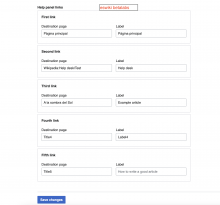
The proposed design in the parent task T360445: Propose a control for collections displays the "title" and "label" fields in-lined instead of stacked. This is a fair UX improvement for JSON arrays which items are objects.
Note: Applying it to all objects could also make sense but it is out of the scope of this task
Design
Acceptance criteria
- JSON arrays which inform "items": { "type": "object" } should render the object properties in-line
Open questions
- What's the maximum number of fields we should display in-lined? 2? 3?
- How should the last row of fields behave? Expand over all the available space? Take the same width as the field in the precedent row (aka grid style)?


