Test Cases
Test scenarios (under the "Details" tab):
- Default view
- Empty tables
- Pagination
The tests have been conducted on an iPhone SE (2nd gen). The screen size is 375x667px.
Design review
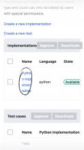
We identified a couple of areas where we might want to improve the table experience on mobile web.
A1 Table Header
The buttons are overflowing outside the table header. They are also visible by default but they should be visible only when one or more table rows are selected.
A2 Spacing
We can optimize the spacing to make the most out of the little real estate available on small screens.
A3 Dimensions
We can set a default max-width for table columns, and truncate text when content is longer than the available space. We're aware that this solution is not ideal but it's a compromise for the time being.
A4 Scroll
When the table is scrollable it shall not increase the bottom padding or margins.
A5 Select
When a table row is selected, the row background color should be highlighted. This is particularly useful when you scroll the table to approve and/or deactivate implementations and/or tests.
B1 Empty tables
When there is no content available the placeholder text should wrap inside the table and not scroll off-the-screen.
C1 Pagination
It seems that the pagination layout is broken. And the input field board is missing around "1".
Design proposals
A design proposal for all the above described issues has been drafted in Figma https://www.figma.com/file/pY72Gsdj7dZ2c6nD4G3W8G/Function-viewer%3A-Mobile-tables?node-id=0%3A1. For any question, suggestion, or doubt feel free to leave a comment here or on Figma.


