Page MenuHomePhabricator

Block notices on mobile web for logged-in users provide insufficient information about the block
Closed, ResolvedPublic5 Estimated Story Points

Description

Problem

I have tested and found this issue using Wikipedia on the mobile web (i.e. MobileFrontend) and the Wikipedia app for iOS. (Apologies if I've filed this under the wrong tags.) On the English Wikipedia, it is policy for administrators, upon blocking a user, to provide certain information about the block. See WP:EXPLAINBLOCK. Using the standard desktop site, whenever a user attempts to edit a page using a blocked account, they are presented with a host of information, including:

  1. The reason for the block
  2. The name of the administrator that place the block
  3. The expiration date for the block
  4. Links to pages that explain what blocks are used for and how to appeal them

It is essential that all four of the aforementioned pieces of information are supplied to a user when they are blocked. Especially for users editing from shared IP addresses, blocks can affect innocent users, and for users contributing in good faith, a block intended to be temporary (e.g. for edit warring) can turn the blocked user away from the project in bitterness if the block is not explained and if avenues for appeal are not provided.

I created a test account and blocked the account with the reason "Testing what a block looks like on mobile" and with an expiration date of 1 week. This was the notice I saw on my desktop when I tried to edit the sandbox:

Screen Shot 2017-05-16 at 12.52.08 PM.png (1×2 px, 512 KB)

This notice is supplied by the English Wikipedia's interface page MediaWiki:Blockedtext.

On a mobile device, however, we have a different story. I used Safari on my iPhone 6s, running iOS 10.2, to access Wikipedia using the MobileFrontend and attempted to edit the sandbox using my blocked test account. (This is the same block from when I tried it on my desktop computer.) When I clicked the pencil icon to edit the page, here is what I saw.

IMG_5176.PNG (1×750 px, 131 KB)

The notice does mention the administrator that placed the block (me in this case) as well as the reason for the block, but as you can see, the block reason fails to display a hyperlink properly, displaying the raw HTML code for a link instead. Furthermore, the notice says nothing about the expiration date for the block or how the block can be appealed.

Replication steps (Testing criteria)

Acceptance criteria

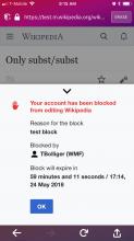
  • When a person is blocked from editing on the mobile web skip taps an edit pencil, display the block in a drawer (as per the mockup below)
  • The UI messages and icons should match the design
    • 'Got it' should be 'OK'
  • The blocking user and expiration date should accurately display
    • If the expiration is set to 'indefinite' the expiration info should not display
  • Tapping the down arrow or 'Got it' button should close the drawer
  • The block reason should display as plaintext, except for links.
    • Links should display as blue links and on tap open in the same tab.
    • Templates should render as plaintext, e.g. {{anonblock}}
    • If there is no reason, the reason info should not display
  • Test for long usernames, block reasons, and in long languages (e.g. German translations)

Mockup

blocked.png (1×750 px, 123 KB)

Additional notes

Patches

Additional sign off steps

Related Objects

Event Timeline

There are a very large number of changes, so older changes are hidden. Show Older Changes

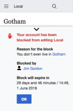
Here's what we have. I've moved the "Need Help?" link to a separate task T193173.

Screen Shot 2018-04-26 at 18.48.20.png (480×320 px, 21 KB)

Are you needing code review from our team? If so please feel free to add the #readers-web-kanbanana-board tag to this task to put it onto our radar!

Are you needing code review from our team? If so please feel free to add the #readers-web-kanbanana-board tag to this task to put it onto our radar!

The more the better! I have no idea what I'm doing! :)

Hey @dbarratt — I'll be handling design review on this so feel free to ping me when you're ready for review. Thanks!

@alexhollender hey! and welcome! So @Jdlrobson left some feedback on the patch that I should use the icon library that is in MobileFrontend, however, the icon provided by @Nirzar in T165535#4143873 is not in the proper format. I tried to get in the right format (by making it square and smaller) but I don't think I did it correctly because it ended up being mangled (as you can see in T165535#4158831). Would you mind getting the icon to be similar to existing ones found here: https://github.com/wikimedia/mediawiki-skins-MinervaNeue/tree/master/resources/skins.minerva.icons.images/ ?

Here's what we have with @Jdlrobson's requested changes.. the only change I haven't made is to the icon because it's not in the proper format.

Screen Shot 2018-05-02 at 12.40.38.png (480×320 px, 20 KB)

The padding/spacing around the top chevron feels crowded, but I defer to @alexhollender

@dbarratt I've attached the icon here. Let me know if that works better. Also it looks like we normally set the icon color via css, so I made it black.

Is there any way for me to pull up the feature on my own machine to review?

@alexhollender loaded this up on staging. Please use the BlockedUser account.

@alexhollender Thanks!

Here's what we have with the icon change:

Screen Shot 2018-05-03 at 10.04.08.png (480×320 px, 22 KB)

@Jdlrobson I noticed that the block notice for IP users is here:
https://phabricator.wikimedia.org/diffusion/EMFR/browse/master/resources/mobile.editor.overlay/EditorOverlay.js;7b8996b53f4960116e5b65657833e01246cddad1$388

Should the block notice drawer be moved up into the extension or should the extension not handle this (errr... fire an event?) and let the skin handle it?

Regardless, it might be better to make IP User Block Notices on mobile a separate task if @TBolliger is fine with that.

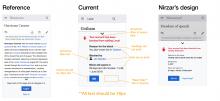
@dbarratt looking good. I made a few notes on the screenshot you posted (I checked staging but it doesn't seem to be as up to date as the screenshot you posted).

notes.jpg (1×3 px, 1 MB)

Also — I know that we use this tray component in other parts of the app (e.g. if you're logged out but try to "star" a page). I was wondering if updates you make here are specific to this instance of the tray, or if you can make more general updates? It'd be great to keep all instances as consistent as possible (e.g. the amount of spacing between the top of the tray and the downwards pointing chevron). Also, for example, I noticed that in Nirzar's design the background of the page has a transparent dark overlay, bringing the attention more to the tray. If we implement that here, it'd be great to make sure it's part of the tray component globally.

In T165535#4179001, @alexhollender wrote:

Also — I know that we use this tray component in other parts of the app (e.g. if you're logged out but try to "star" a page). I was wondering if updates you make here are specific to this instance of the tray, or if you can make more general updates?

We can do either. :) but obviously making broader changes is somewhat out of scope and should have more people QA'ing the changes. :)

Also, just a note, my screenshot is not the same dimensions as @Nirzar's, I used the minimum screen width (320px) would you like one that is the same dimensions?

@dbarratt probably what would be best is for me to review the feature on staging. I think most of the comments I left are still helpful though, so maybe let me know once you've had a chance to make some of those updates and then put it up on staging for review?

@dbarratt @alexhollender when the new patchset is up I can put it on our staging environment for testing.

[...] making broader changes is somewhat out of scope and should have more people QA'ing the changes. :)

Yes, true, the Anti-Harassment Tools team doesn't have spare time to chase down and fix any cascading defects these adjustments might make. At the same time, we'll never achieve visual consistency with this type of thinking...

I propose that we move forward by making these adjustments to all drawers if Alex, Jon, or someone else can help with QA for other drawer instances.

@TBolliger @dbarratt — ok, the only change we'd need to cascade (if we made it) would the dimming the background of the page when the drawer is open. Otherwise nothing proposed here will cause this drawer to be out of sync with others. If we want to take the dimming feature on here I'm happy to QA the other instances, but I'd say it's not at all critical.

Change 431634 had a related patch set uploaded (by Dbarratt; owner: Dbarratt):
[mediawiki/extensions/MobileFrontend@master] Update Drawer appearence to bring better focus and spacing to drawers

https://gerrit.wikimedia.org/r/431634

I've updated the patch the skin and added a new patch for the extension, the result is something like this:

Screen Shot 2018-05-07 at 13.43.59.png (1×750 px, 50 KB)

@dbarratt looks good. sorry, a few last things I didn't catch the first time around. Here is what it should look like. I've noted the changes I made in the inspector to the css. Of course feel free to add the margin/padding to different elements to achieve the same results:

Artboard Copy.jpg (2×3 px, 1 MB)

Also, to confirm, are we not doing the "Need help?" link?

In T165535#4190166, @alexhollender wrote:

Also, to confirm, are we not doing the "Need help?" link?

That was moved to a seperate task T193173: Add the 'Need Help?' Link to the Block Message drawer also in the acceptance criteria of this task:

'Got it' should be 'OK'

I'll make the other changes. :)

I believe I've made all the requested changes, Please let me know if I missed something.

@alexhollender I converted your pixels to em, but it should be the same amount of space.

Screen Shot 2018-05-08 at 11.51.40.png (1×750 px, 47 KB)

Change 431634 merged by jenkins-bot:
[mediawiki/extensions/MobileFrontend@master] Update Drawer appearance to bring better focus and spacing to drawers

https://gerrit.wikimedia.org/r/431634

@alexhollender I'll commit to getting this merged today. I've refreshed staging again with the latest adjustments.

@alexhollender haha! I just fixed the spacing of the hand icon:

Screen Shot 2018-05-08 at 13.07.26.png (1×750 px, 47 KB)

This is a new palette color. Do you know what name it has on the style guide and if it is has (or needs) a corresponding variable?

@alexhollender and @Nirzar right now I'm using #ce3a3a for the red title text, is this the correct color or should a different color be used? If it's correct, do you have an answer to @Jdlrobson's question?

Great! updated the patch with the updated color:

Screen Shot 2018-05-08 at 13.19.48.png (1×750 px, 47 KB)

TBolliger renamed this task from Block notices on mobile web provide insufficient information about the block to Block notices on mobile web for logged-in users provide insufficient information about the block.May 8 2018, 7:12 PM

Change 426641 merged by jenkins-bot:
[mediawiki/skins/MinervaNeue@master] Use a Drawer for Block Notices

https://gerrit.wikimedia.org/r/426641

dbarratt moved this task from Review to Done on the Anti-Harassment (AHT Sprint 20) board.
Jdlrobson reassigned this task from dbarratt to alexhollender_WMF.
Jdlrobson added a subscriber: dbarratt.

Since it's in our process, this will needs to go through one final design review and QA before resolving to check we haven't broken anything else.
I've deployed the code to https://reading-web-staging.wmflabs.org/ @alexhollender can you check it and then pass to Anthony?

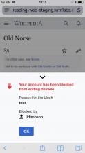
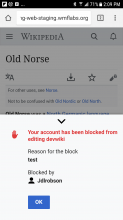
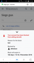
@Jdlrobson @dbarratt: just checked on Android and iOS — both look good. For me the "block will expire in" element is missing, which I assume is due to the type of block not an issue with the feature, however if we want to be thorough with testing it'd be great if I could see that as well.

IMG_AB37CA05C44E-1.jpeg (1×750 px, 239 KB)
Screenshot_20180509-140936.png (2×1 px, 197 KB)
iOS screenshotAndroid screenshot
In T165535#4193960, @alexhollender wrote:

For me the "block will expire in" element is missing, which I assume is due to the type of block not an issue with the feature, however if we want to be thorough with testing it'd be great if I could see that as well.

This is because the block is infinite (it has no expiration), @Jdlrobson should be able to add an expiration to the block which will make the line appear.

looks great. Going to move this to QA. @ABorbaWMF testing steps are in the description.

@dbarratt one final thought, maybe we can simplify the formatting of the expiration date (is the exact time is necessary? you would know better than me). Perhaps the date can just round up to the next calendar day at midnight. Will leave this call to you as you have more context about the feature :)

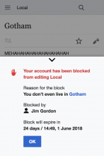
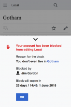
reading-web-staging.wmflabs.org_wiki_L%C3%BCshunkou_District(iPhone 6_7_8).png (1×750 px, 136 KB)
reading-web-staging.wmflabs.org_wiki_L%C3%BCshunkou_District(iPhone 6_7_8) (2).png (1×750 px, 135 KB)
current formatsimplified format
In T165535#4196465, @alexhollender wrote:

@dbarratt one final thought, maybe we can simplify the formatting of the expiration date (is the exact time is necessary? you would know better than me). Perhaps the date can just round up to the next calendar day at midnight. Will leave this call to you as you have more context about the feature :)

The user can specify the format of all datetime(s) on their preferences, as en example:
https://meta.wikimedia.org/wiki/Special:Preferences#mw-prefsection-rendering

Screen Shot 2018-05-10 at 14.14.56.png (526×1 px, 41 KB)

We could reject this preference and set a custom date format, but it would need to work across all languages. I believe we have all of the months translated, so it's more of a question if the format is acceptable in all languages/cultures.

Let me know how you'd like to proceed.

In T165535#4196465, @alexhollender wrote:

is the exact time is necessary?

I think it is, but @TBolliger or @SPoore would have a definitive answer. :)

Oh hey! An opportunity to use some of the block data we just generated:

Screen Shot 2018-05-10 at 11.37.48 AM.png (115×315 px, 20 KB)

Sitewide blocks set from April 30-May 6 2018. Note that this is blocks, not users who will see the drawer (which likely varies depending on why the user was blocked.)

Most blocks appear to be in days, not hours. But I think a perfect situation would be "show only days until it's less than 24 hours, in which case show the exact expiration time" but this sounds like overcomplicated logic just for this ticket, which has already faced enough delays. As PM I say ship as-is.

Most blocks appear to be in days, not hours. But I think a perfect situation would be "show only days until it's less than 24 hours, in which case show the exact expiration time" but this sounds like overcomplicated logic just for this ticket, which has already faced enough delays. As PM I say ship as-is.

The relative time will always show the greatest unit (i.e it will show "days", "years", "minutes", etc.), I think what @alexhollender is asking is if the exact time (precise, not relative) of expiration is required. Given our work on T132220, I would say that giving a precise time (as well as a precise date) is required.

Oh, duh, yeah! I meant "show only the day of unblock until <24 hours, in which case show the date + time. Feasible?

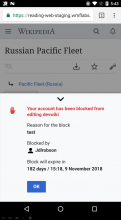
Looks good to me across a few devices/browsers.

android/chromeandroid/firefoxiphone/safari
image.png (1×720 px, 183 KB)
image.png (984×540 px, 119 KB)
image.png (667×376 px, 85 KB)
iPad/Operaandroid/maxthon
image.png (1×1 px, 515 KB)
image.png (1×720 px, 185 KB)

Oh, duh, yeah! I meant "show only the day of unblock until <24 hours, in which case show the date + time. Feasible?

Yes. That's possible.

Sorry @alexhollender I was wrong, there is a way to get just the user's preferred date it's located in Language::userDate() and we could use that to get the block date in the user's preferred format.

I recommend creating a separate issue for this if we'd like to pursue it, it should be fairly trivial.

Let's make a new ticket, thank you David.

When would you expect to see this in production?

Looks all done from this side. @TBolliger - would you like to sign off or should I?

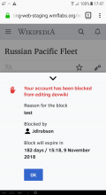
Just verified on production!

IMG_5A7B6A074462-1.jpeg (1×750 px, 338 KB)