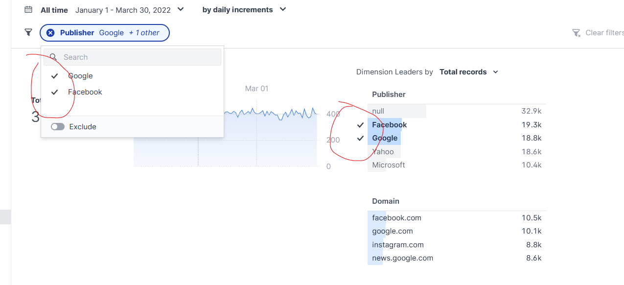
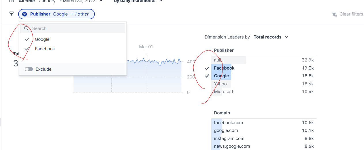
increases visual weight of filter icons in filter pill menu #1512
Add this suggestion to a batch that can be applied as a single commit.
This suggestion is invalid because no changes were made to the code.
Suggestions cannot be applied while the pull request is closed.
Suggestions cannot be applied while viewing a subset of changes.
Only one suggestion per line can be applied in a batch.
Add this suggestion to a batch that can be applied as a single commit.
Applying suggestions on deleted lines is not supported.
You must change the existing code in this line in order to create a valid suggestion.
Outdated suggestions cannot be applied.
This suggestion has been applied or marked resolved.
Suggestions cannot be applied from pending reviews.
Suggestions cannot be applied on multi-line comments.
Suggestions cannot be applied while the pull request is queued to merge.
Suggestion cannot be applied right now. Please check back later.
fixes #1261 by darkening the icons in the filter pill
Note: this is a bit of a hack -- it hard codes the color because
currentColorwas not actually being set correctly by the upstream styles. There are a lot of layers of cascading in play here, so I thought this was an expedient solution to get us the look we want until we overhaul our approach to stylingthis branch:

main (note lighter gray icons in filter pill menus_:
