Complementary design

Discover Pinterest’s best ideas and inspiration for Complementary design. Get inspired and try out new things.
622 people searched this
·
Last updated 1mo
Joel S – Color Schemes

This image shows a design with color harmony. The color scheme used in the design is split-complementary. The bright yellow is the one being complemented by the blue and purple. The main color, yellow, has a bright chroma while the split-complementary colors are darker hue. This helps us know which color complimented.

2.1k
Abstract parrot illustration created from shapes filled with complementary colours. Colours: mint, red, orange, white & dark blue.

Bring your room to life with this beautiful big and bold parrot art. With a choice of four colours there perfect for most rooms of your home. The simple graphic shapes combined with complementary colours will bring a modern look to your home. Browse more products with this design on redbubble.com

14.1k
What Are Split-Complementary Colors? Best Ways to Use This Color Scheme

Although colors are a part of our daily lives, there are many variations to them and their uses that not everyone may take advantage of it. Take split-complementary colors, for example.

85
Download free vector of Colorful abstract vector posters with bold orange, blue, and white… in 2025 | Blue design graphic, Poster design inspiration, Graphic design posters

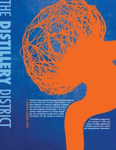
Download free vector of Colorful abstract vector posters with bold orange, blue, and white designs. Creative, vibrant, and artistic layouts. Perfect for modern, artistic, and creative themes. Blue and orange vector posters. by Tang about flower set, collection of abstract shapes, floral, flower, and poster templates 15925029

2.1k
101 Most Commonly Used Interior Designs & Terminology | Complementary colors, Retro color palette, Color theory

Unlock 101 Interior Design Terms! ️ Our list simplifies decorating lingo. Boost your design vocabulary now!

298
Watercolor Handbook - Values - WetCanvas

also called , are simply the lights, darks, and midtones in a painting. However, their importance to the success of a painting can’t be stressed enough. They […]

179
Color Psychology in Marketing: The Ultimate Guide | Split complementary colors, Split complementary color scheme, Color psychology personality

Color psychology in marketing and branding is more than just one-sentence explanations of what each color represents. It’s true that specific colors can influence the choices of consumers. Color can affect the brain’s emotion sensors in many ways. It can call attention, inspire emotions, give assurance or tap into nostalgia. But the psychology of color

253
Colour Reinterpretation | Graphic poster, Poster design, Orange design

Poster Original First Draft On my first draft I decided to apply colours that would help me show the viewer what I was trying to convey through the design of the poster. I used a complementary sche…

39
Color Wheel Palettes for Interior Design

Anybody can use color theory in home decor. Learn how to use a color wheel to create palettes of complementary color to create color ...

246

Related interests

Complementary design and more

Explore related boards