Melissa Ward | Preppy Goods on Instagram: "Comment PAINT if you want the details sent directly to you 🤍 Anyone else have an obsession with paint colors? Or is it just me? If you’re currently looking for paint colors I’ve saved all of the information from both our old house and new house in one blog post. I’m talking paint samples, colors, finishes and more! It’s even more detailed than the notes on this post. 🩵 You can find everything on my website preppygoods.com and look for the…

Loralee AhMu on Instagram: "Van Deusen Blue by Benjamin Moore is a gorgeous, deep blue with just the right amount of sophistication and richness. It’s not too bright, but it’s definitely bold—think of it as a cozy, moody navy that can make a room feel both dramatic and inviting. It has a timeless quality that works great in living rooms, dining rooms, or even bedrooms, giving those spaces a sense of depth and elegance. What I love about Van Deusen Blue is how it pairs effortlessly with…

9 Interior Paint Colors Buyers Hate—and What to Use Instead
The soft, Sherwin-Williams Stardew blue walls in the living room help unify this space with the adjacent kitchen and keep things feeling open and spacious. A large coquina fireplace brings a historic element found throughout St. Augustine design into the living area and connects this space with the area's history.

Loralee AhMu on Instagram: "Philipsburg Blue, Normandy, and Mount Saint Anne by Benjamin Moore are three absolutely gorgeous blues, each with its own unique personality. 1️⃣ BM Philipsburg Blue is a classic, vibrant blue with a slightly historic feel. It has just enough gray in it to keep it from feeling too bright, but it still brings a strong, confident presence to a room. 2️⃣ BM Normandy is a deeper, moodier blue with a touch of slate-gray undertone. It has a really sophisticated…

Loralee AhMu on Instagram: "Baby Fawn by Benjamin Moore is one of those perfectly soft and versatile neutrals that can work just about anywhere. It’s a warm greige making it adaptable to different lighting conditions. In brighter rooms, it leans more toward a soft, creamy beige, while in lower light, the gray undertones come through, giving it a cozy and grounded feel. If you’re looking for a color that feels inviting without being too yellow or too cool, Baby Fawn is a solid…

Loralee AhMu on Instagram: "Sherwin Williams Natural Choice is one of those underrated gems that totally pulls its weight as a warm, creamy off-white. It has just the right mix of softness and warmth, which makes it feel cozy without being yellow or too beige. Whether you’ve got wood tones, black accents, or soft greens, this color complements them effortlessly. It even does well on exteriors if you’re aiming for a warm, neutral facade that still feels fresh. If you’re after a cozy…

Loralee AhMu on Instagram: "Sherwin Williams Natural Choice is one of those perfect off-whites that feels soft, warm, and effortlessly inviting. It has a creamy, beige undertone that gives it a cozy, lived-in feel without looking too yellow or too stark. It’s a fantastic choice if you want a neutral that leans warm but still feels fresh and airy. Whether you’re using it for walls, trim, or even cabinetry, it brings a natural softness that works beautifully in both modern and traditional…

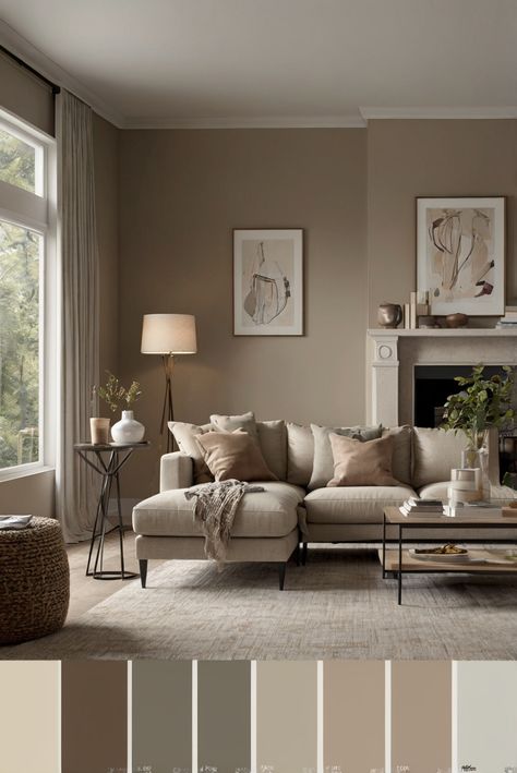
Karolina De Costa on Instagram: "Think beige walls = boring? Nope! Beige is the perfect background for furniture, fabrics, art and decor. Check out Benjamin Moore Grant Beige HC-83. This warm golden tan has a slight hint of gray for softness and leans ever slightly to the green - making it the perfect pairing with woods like mahogany, walnut, maple or even oak! It’s deep enough not to be washed out in large well lit rooms but a golden warmth makes it a good fit for north facing spaces…

Loralee AhMu on Instagram: "Natural Linen by Sherwin Williams is one of those effortlessly warm, neutral shades that makes any space feel inviting and comfortable. It has a soft beige undertone with a hint of warmth, which keeps it from looking too cold or gray. Natural Linen is perfect if you want a neutral that feels cozy but still has a light, airy quality to it. It’s great for creating a relaxed, homey vibe that doesn’t overpower other colors or decor in the room, and it plays well…

Rachel Andrea: The Willow Window on Instagram: "My most Frequently Asked Question is about the paint color of the walls in our home. They are windfresh white in satin finish. I painted this color in 2020 and still love it. It's such a pretty, very light, soft neutral. ✨️To shop my home Like + Comment Shop for links sent to DM! Follow me @thewillowwindow, or the link will not go through. #paintcolors #interiordesign #homeinspo #homedecor #asthetics #livingroom"

Home Inspiration and DIY by Theresa on Instagram: "Natural Linen by Sherwin-Williams transformed our trim and beadboard into the perfect cozy backdrop. This warm neutral brings just the right touch of elegance and charm. What do you think of this color? ✨Save and follow @theresachristinehome for more home inspiration."

Loralee AhMu on Instagram: "Amazing paint combo👇🏼 1️⃣ BM Van Courtland Blue is a stunning, muted blue with subtle gray undertones, giving it a refined and slightly historic feel. It’s the kind of blue that adds personality without feeling too bold. This would be gorgeous on kitchen cabinets, a bathroom vanity, or even as an accent wall in a bedroom or office. 2️⃣ BM Manchester Tan is one of those perfect warm neutrals that never feels too beige or too yellow—it has a soft, earthy…
RACHEL | Home Styling & DIY Design on Instagram: "My most Frequently Asked Question is about the paint color of the walls in our home. They are windfresh white in satin finish. I painted this color in 2020 and still love it. It's such a pretty, very light, soft neutral. ✨️To shop my home Like + Comment Shop for links sent to DM! Follow me @thewillowwindow, or the link will not go through. #paintcolors #interiordesign #homeinspo #homedecor #asthetics #livingroom"

Loralee AhMu on Instagram: "Stardew by Sherwin Williams is a dreamy, soft blue with a touch of gray. Because it has a subtle gray undertone, it doesn’t come across as too bright or overly baby blue, making it a perfect choice for those who want a hint of color without it feeling overwhelming. It pairs wonderfully with crisp whites for a fresh, coastal vibe or with warm neutrals like greige and soft beige for a cozy, balanced feel. Whether you’re looking for a soft pop of color for…

Loralee AhMu on Instagram: "Details👇🏼 Bring the laid-back charm of a lakeside retreat into your home with the SW Lake House paint palette! This carefully curated collection of blues and timeless neutrals creates a fresh, serene, and effortlessly stylish vibe. Whether you’re dreaming of breezy coastal blues or cozy, grounding neutrals, this palette has the perfect mix to make your space feel calm, inviting, and totally you. Perfect for a cohesive whole-home look with just the right…
We think you’ll love these